A fictitious case study, created as a thought experiment, aims to challenge habits and inspire new ideas for better interactions.
Enogood originated to amplify local, Italian, and KM0 food accessibility, providing quality produce at valuable prices for everyone.
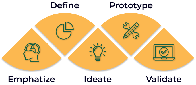
To upgrade the Enogood website, I followeda Design Thinking method, emphasizing user empathy, problem framing, idea generation, prototype development, and practical testing.
I have achieved pivotal milestones:
I conducted 10 user interviews to discover why many customers who visit the online websites end up buying the products offline.
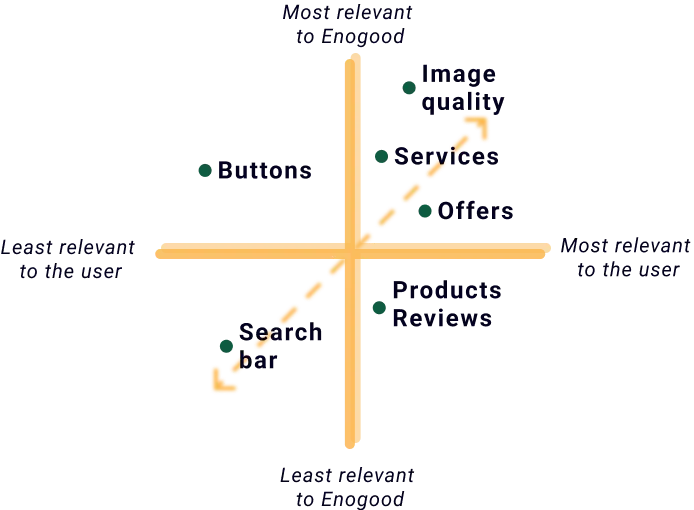
Listening to users' stories shaped my understanding of their needs. By exploring website usability and marketing materials, I used empathy-driven tools like affinity mapping and a 2x2 matrix to prioritize and resolve crucial pain points for Enogood's impactful design decisions.
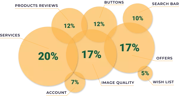
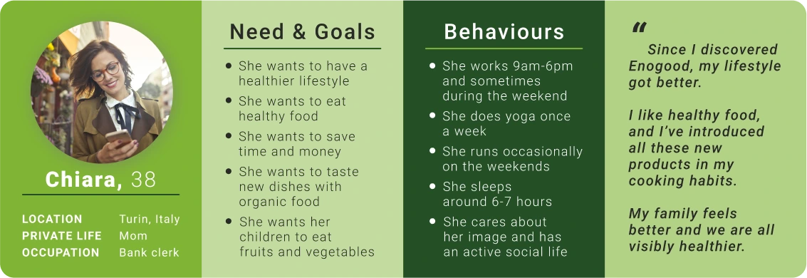
Using the data, I crafted a preliminary persona to understand Enogood's potential users. Analytics indicated that, over the past years, 83% were adult women.

I narrowed down my results by re-defining the main four pain points that were both important to users and Enogood:

Call To Action
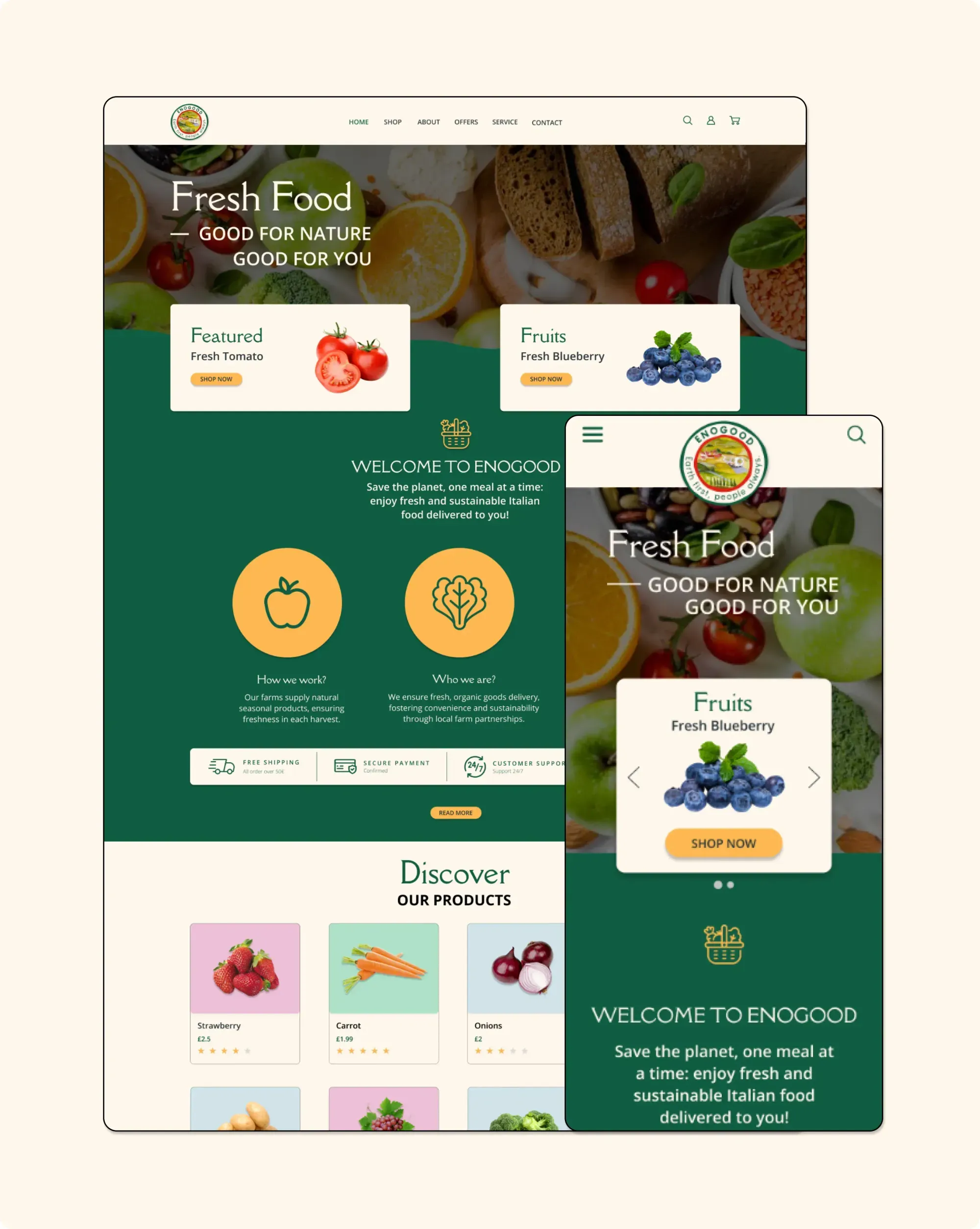
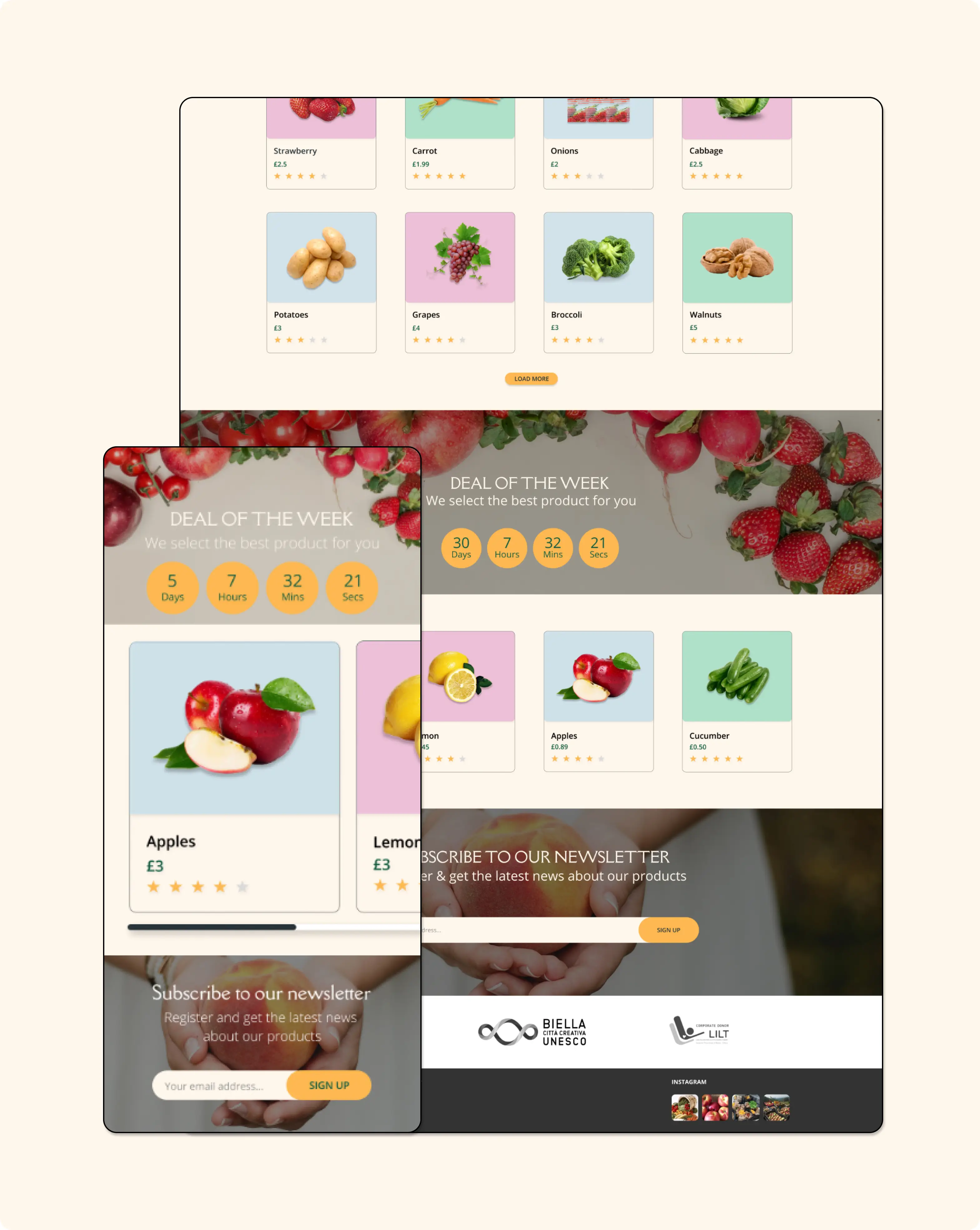
The website lacks clear calls to action, resulting in user inaction and eventual site abandonment.
Services
The lack of a section explaining Enogood's services confuses new users, making it difficult for them to grasp what Enogood offers.


Images quality
High-quality pictures enhance user confidence, encouraging repeat purchases, especially when the images truly represent the products.
Offers
While offering diverse, fresh organic products is key, enhancing the platform's navigation for a more user-friendly experience is crucial.
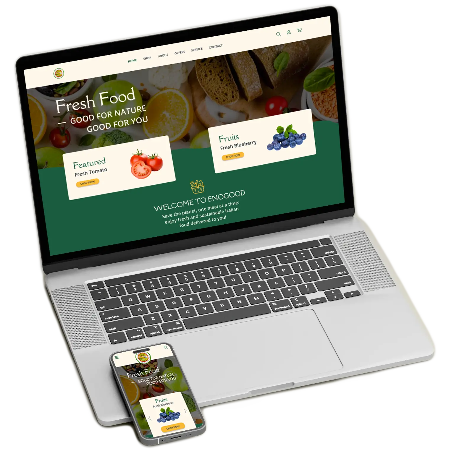
By creating high-fidelity mockups with Figma and Illustrator, I integrated graphics and icons, incorporating user preferences and my design expertise.


A fictitious case study, created as a thought experiment, aims to challenge habits and inspire new ideas for better interactions.
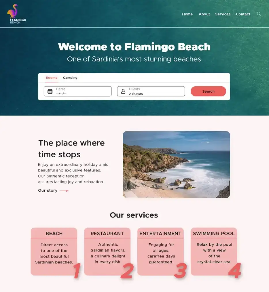
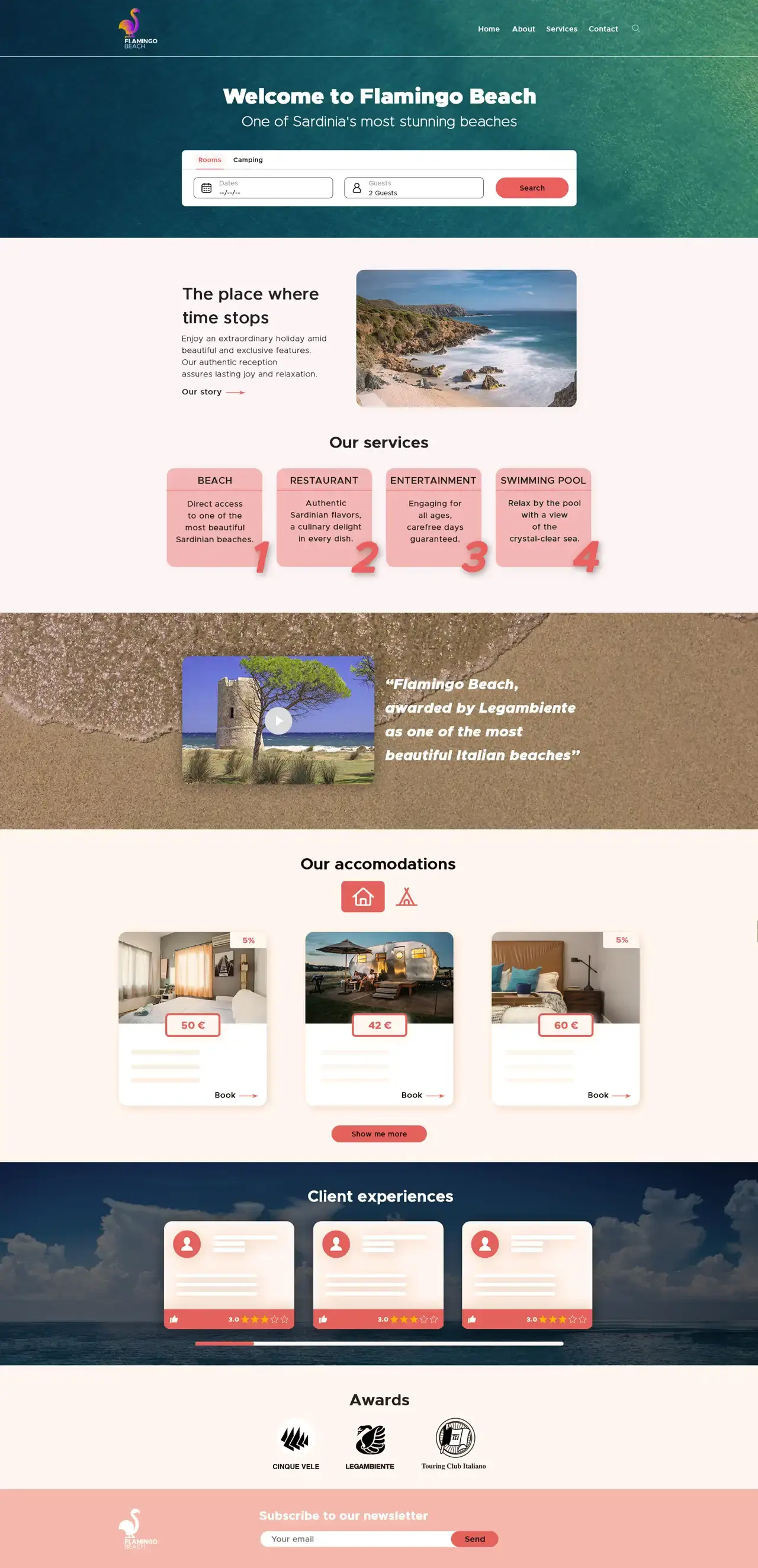
Restructuring website layout to secure a competitive edge, standing out prominently among market competitors.
Before delving into client analysis, extensive research on the resort's market position and online performance compared to top Sardinian holiday competitors provided essential context for the project. Three stood out among the top spots in search engine rankings:
My aim was to compare features among competitor sites and pinpoint opportunities for Flamingo beach's unique value proposition. Identifying strengths and weaknesses was crucial.
With the increasing competition, redefining the logo was vital for brand positioning. Inspired by the yearly spectacle of pink flamingos, the design embraced an attractive character, accentuated by the elegance of the Golden Ratio.

The final mockup incorporated user-friendly elements identified in comparative research, featuring added call-to-action buttons and improved product categorization.
Users struggle to find the best flight options when complex search interfaces overwhelm them, leading to confusion and poor decision-making.
A fictitious case study, created as a thought experiment, aims to challenge habits and inspire new ideas for better interactions.
This concept optimized flight booking, helping users enter details easily and view clear prices instantly, speeding up trip planning and improving business efficiency.
A fictitious case study, created as a thought experiment, aims to challenge habits and inspire new ideas for better interactions.
This concept optimized flight booking, helping users enter details easily and view clear prices instantly, speeding up trip planning and improving business efficiency.
Users struggle to find the best flight options when complex search interfaces overwhelm them, leading to confusion and poor decision-making.
Users struggle to find the best flight options when complex search interfaces overwhelm them, leading to confusion and poor decision-making.
A fictitious case study, created as a thought experiment, aims to challenge habits and inspire new ideas for better interactions.
This concept optimized flight booking, helping users enter details easily and view clear prices instantly, speeding up trip planning and improving business efficiency.
Users struggle to find the best flight options when complex search interfaces overwhelm them, leading to confusion and poor decision-making.
A fictitious case study, created as a thought experiment, aims to challenge habits and inspire new ideas for better interactions.
This concept optimized flight booking, helping users enter details easily and view clear prices instantly, speeding up trip planning and improving business efficiency.
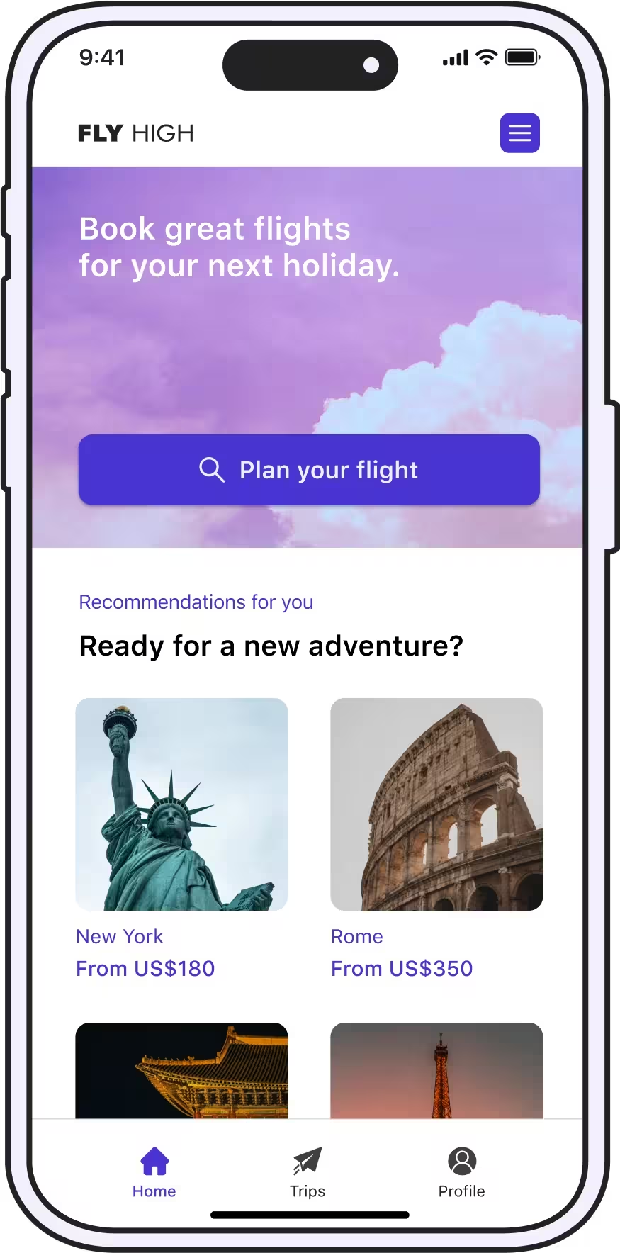
Booking flights frustrates everyone. When you look for a flight, you follow the same steps: changing details to find the best deal. And you might think, “Will modifying my travel date save money? Will a different airport be cheaper?” This search forces you to scroll through endless results, tweak options, and refine your criteria.
Mostly, airline websites follow the same flight search pattern. Is one solution enough? Let’s challenge this with fresh ideas.

A fictitious case study, created as a thought experiment, aims to challenge habits and inspire new ideas for better interactions.
Flight booking websites overwhelm users with information and promotions, pushing them to third-party airfare providers for a smoother booking experience through simpler comparisons.
The idea of a vacation brings joy, but the tedious process of booking flights can quickly deflate our enthusiasm. Can we create websites that are easy to use while also giving us the essential information we need? In light of this question, I carefully investigated this challenge, resorting to research and analysis methods, which have supported insights discovered during my airline case study.
Throughout user interviews, I understood:
As a result, user engagement decreases significantly.
So, something needed to be improved. It was vital to clarify:
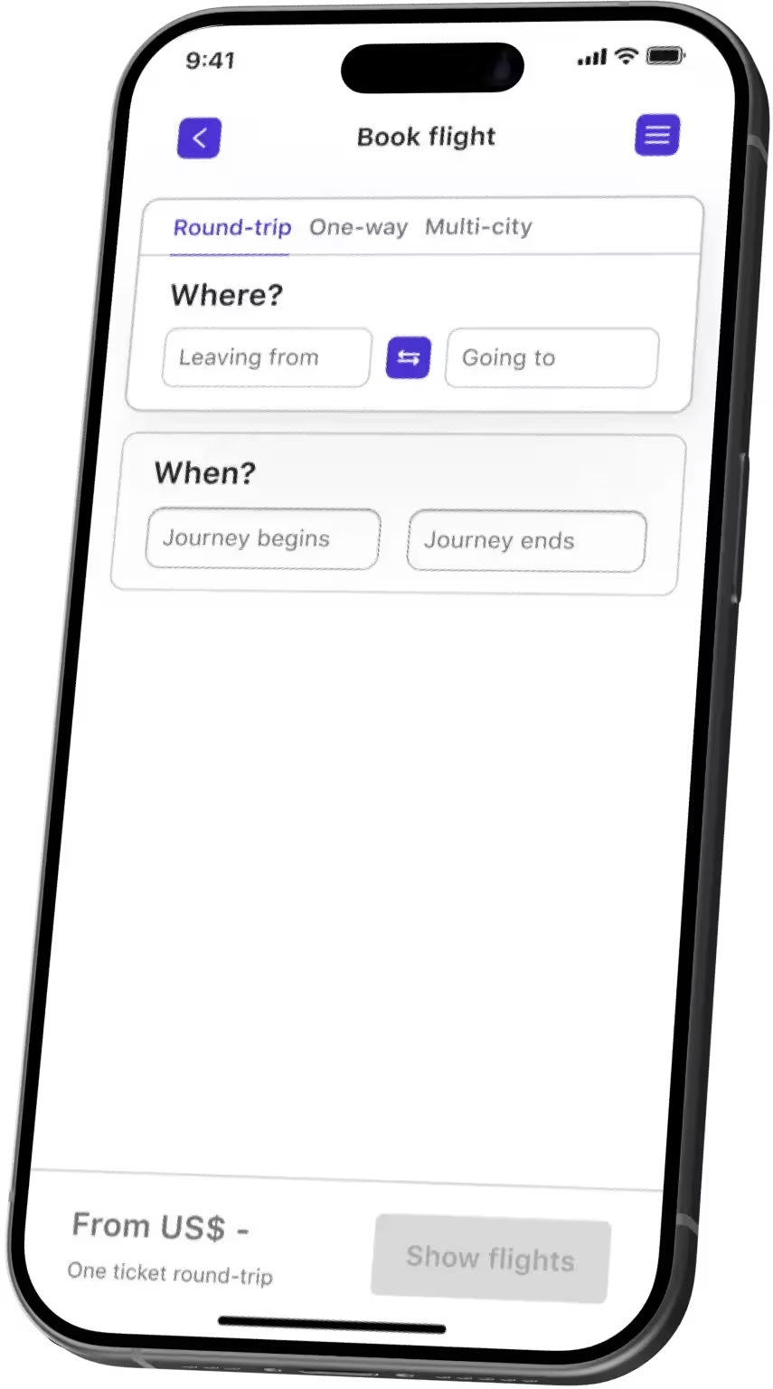
My goal was to structure the website as smoothly as possible.
Flight apps require users to enter specific information before searching for flights, such that no information about suitable flight option is provided before viewing results.
This often leads to users navigating back and forth between pages, to find a solution that works for them: to find out how altering the input details affects the price, users must repeat the search process and scroll through flight results, leading to confusion and a high cognitive load early on.
As a result, the system has to repeatedly fetch and update data. Imagine if you could adjust all the price-related details on the first screen and see an estimated price immediately, before even viewing the results.
Finding a suitable flight revealed common key challenges among users:
- 100% struggled with the constant back-and-forth navigation between screens to adjust parameters and screen through results;
- 40% of users faced difficulties when trying to book multiple tickets with different return options in a single reservation.
This allowed me to define the profile of the common user of Fly High, Ted.
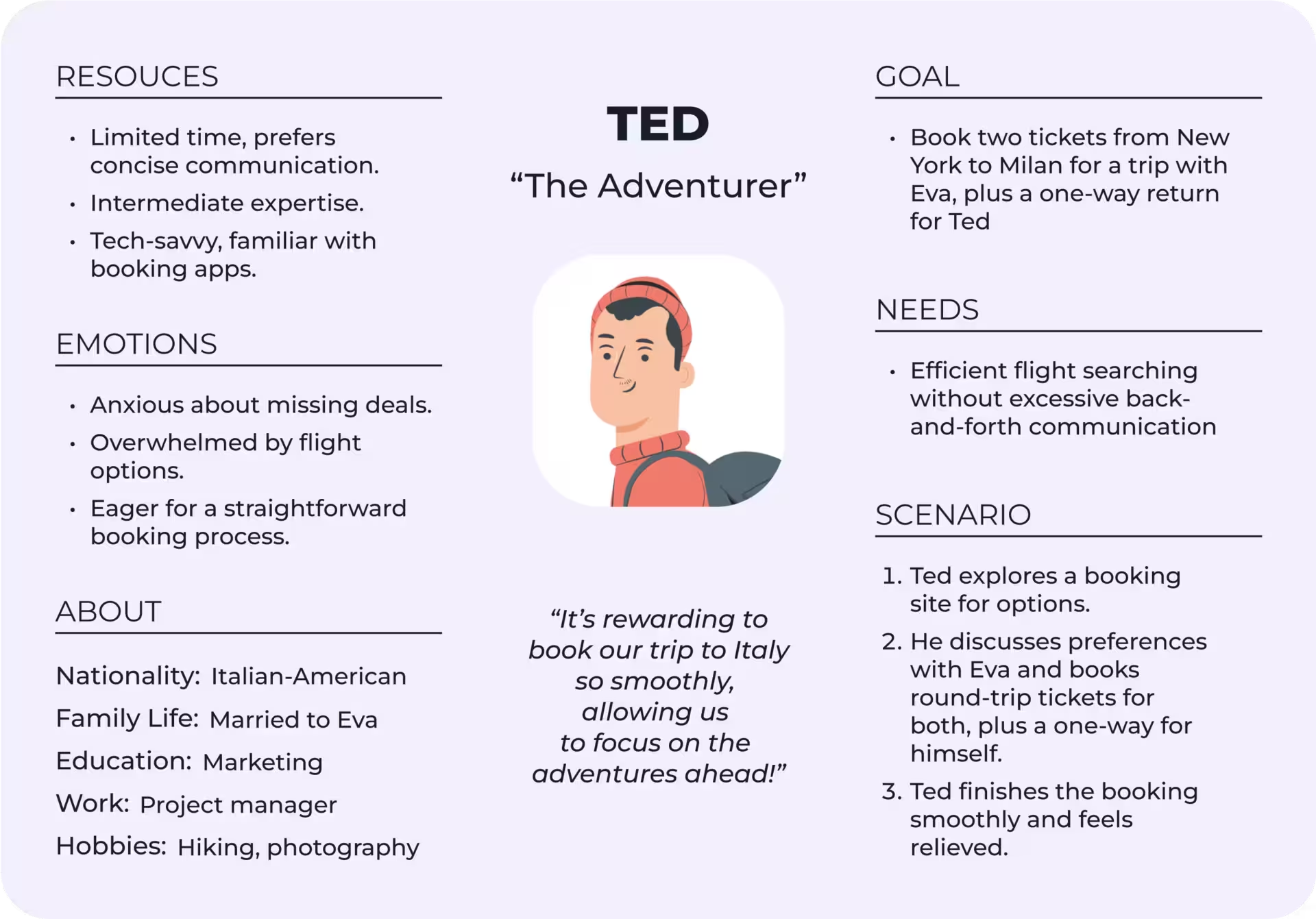
In his quest to find the perfect flight, Ted frequently compares different platforms and adjust various parameters according to his personal priorities. This process highlights his need for a more streamlined and intuitive booking experience.
Two key hypotheses shaped my flight search design solution:
Essential Inputs
By keeping only essential inputs travelers can stay focused and refine the final price more effectively.
Immediate Feedback
Allowing travelers to see price info immediately as they enter details increases the likelihood of relevant results on the first try.
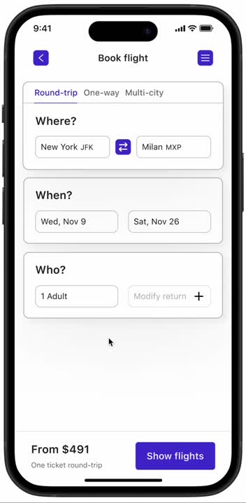
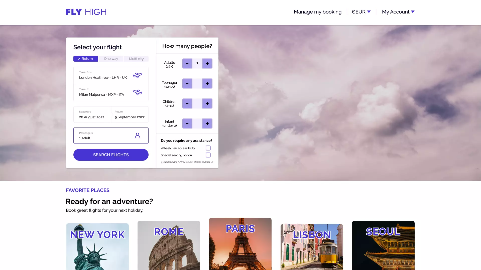
This proposed design centers on the traveler, their needs, and budget. Each entry is given our full attention, using separate dialogue boxes for each entry to reduce cognitive load and create space for content.
Users will know if there is a suitable flight for them before searching and scrolling through results.
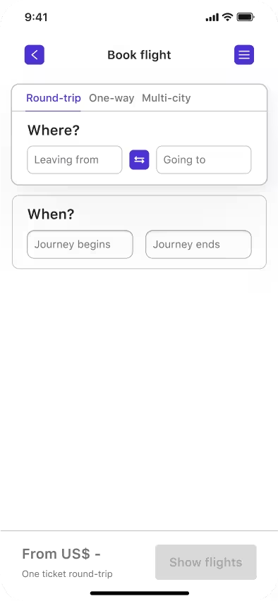

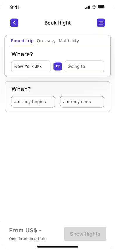
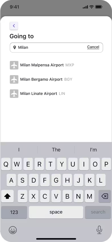
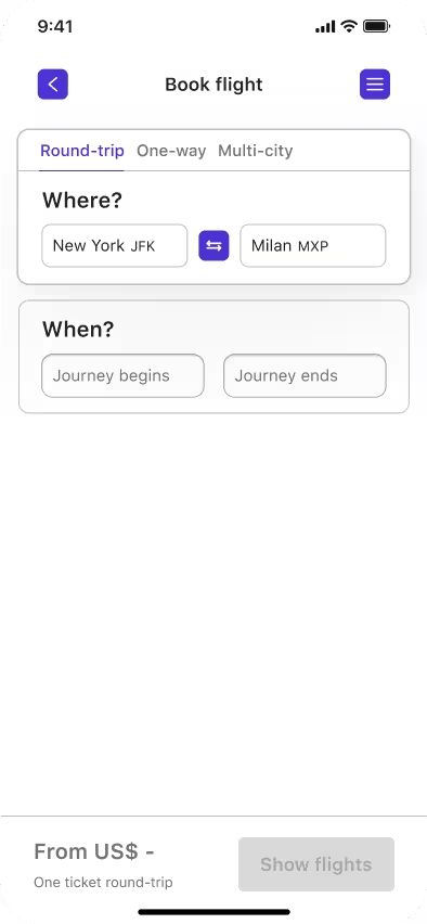
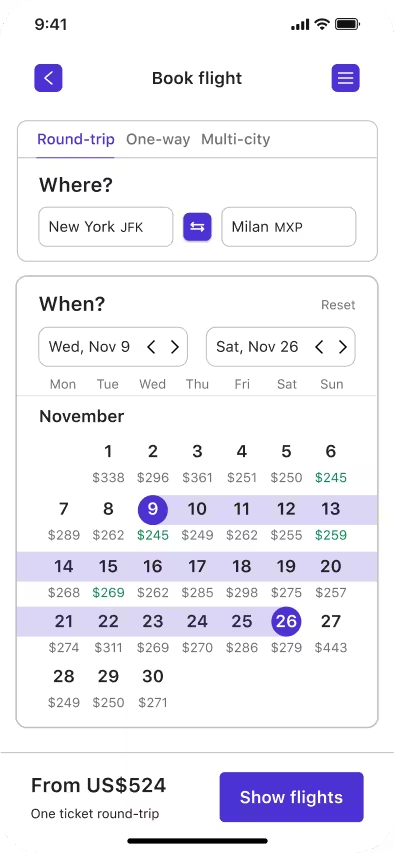

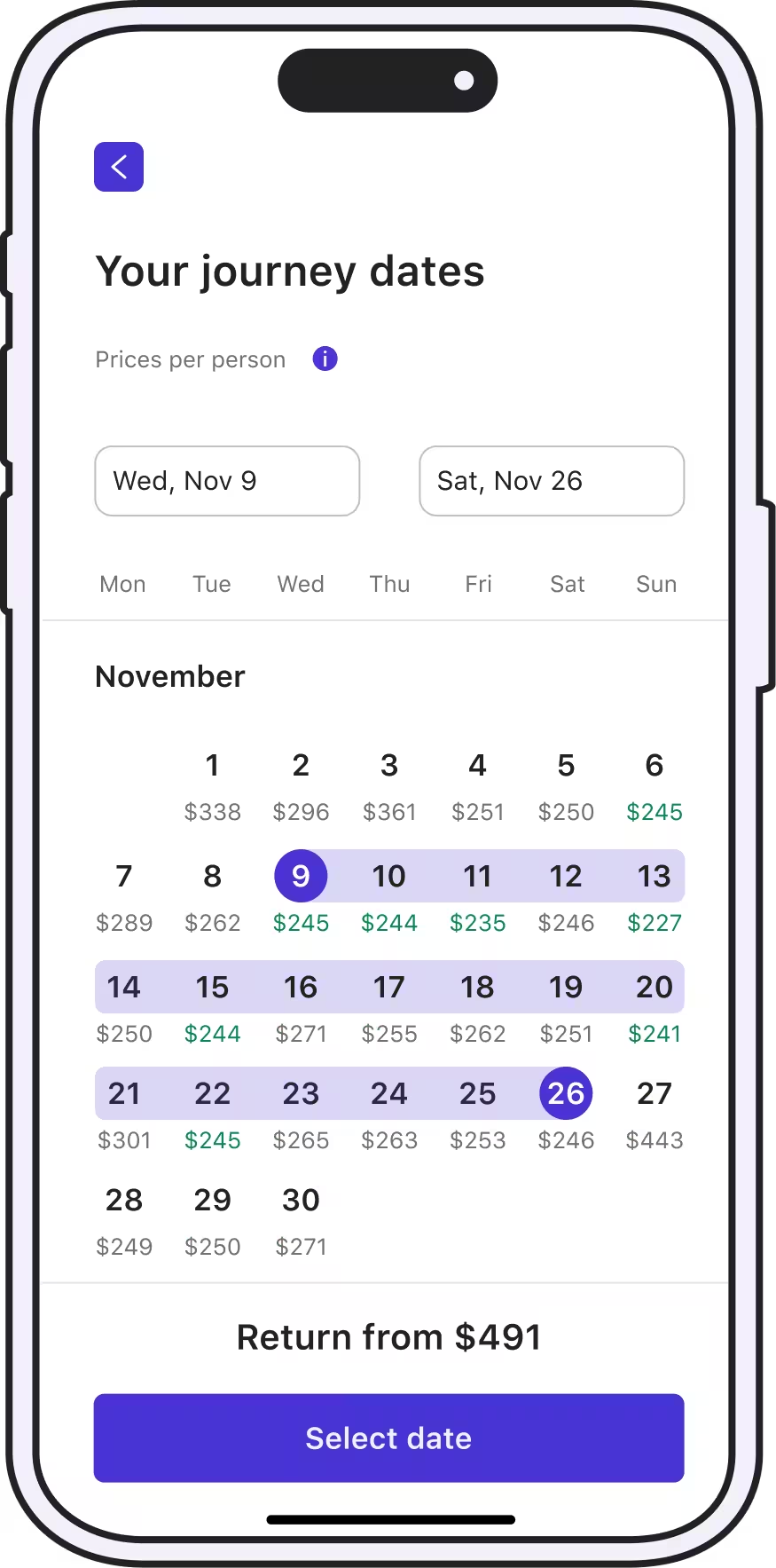
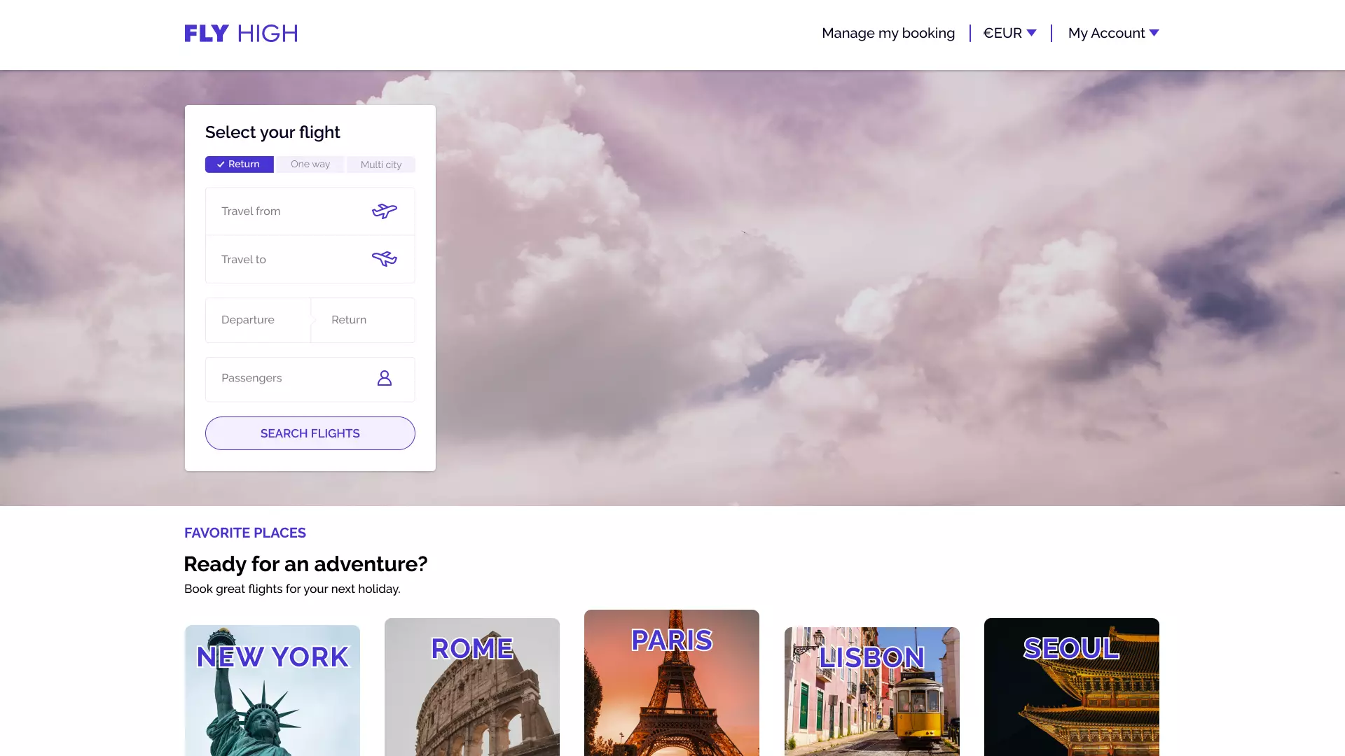
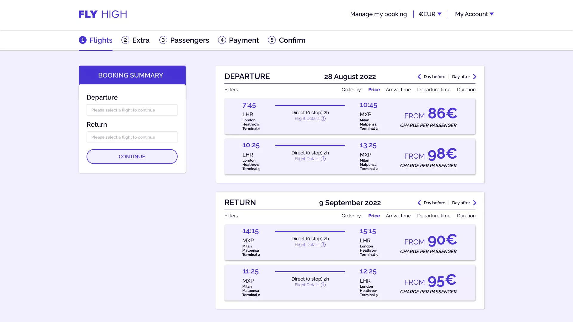
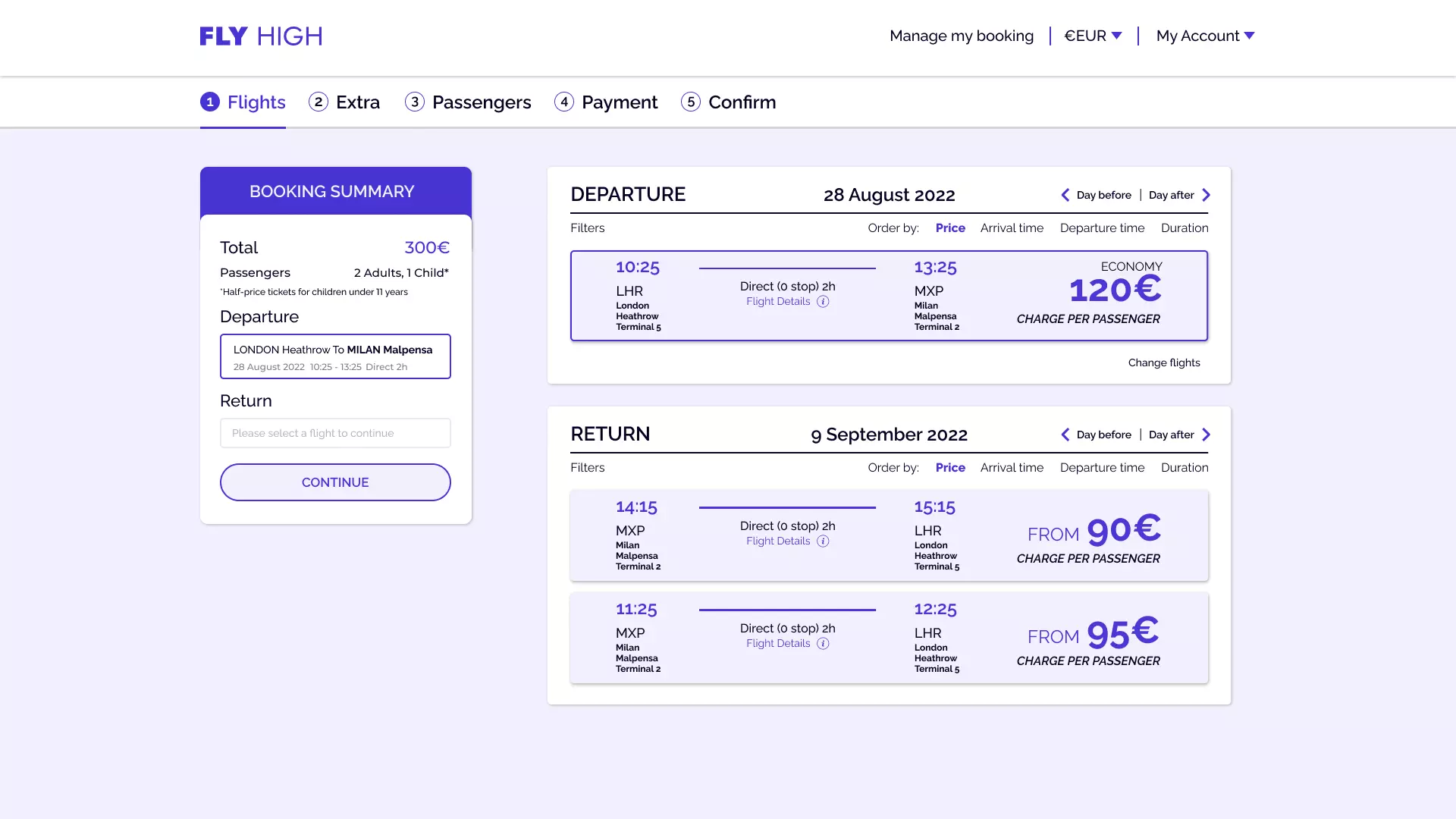
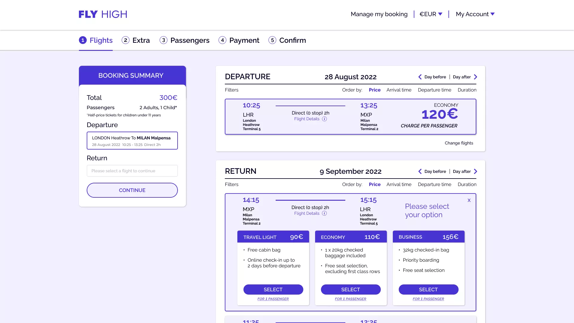
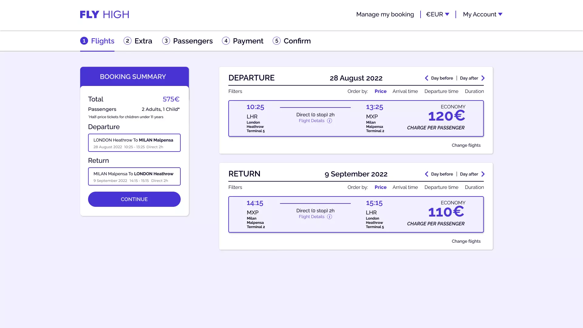
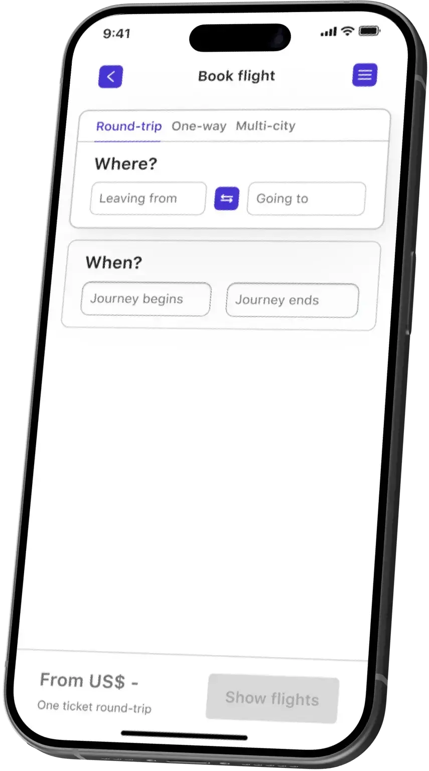
All price-relevant information is displayed together. Users first select one-way or round-trip, a fixed choice they typically have in mind. Then, they can choose flexible departure and arrival points and dates.
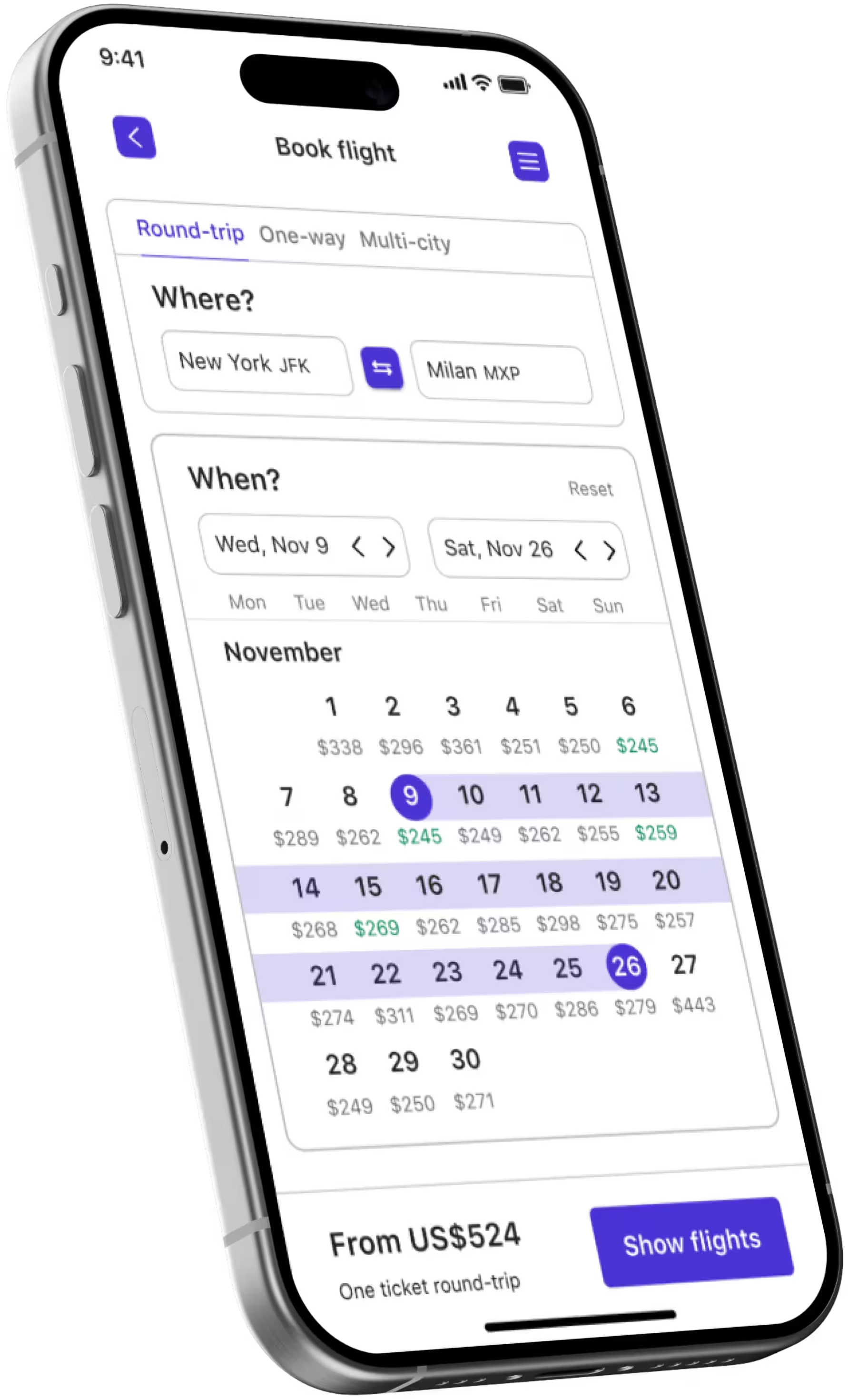
The calendar on the same page lets users see prices without toggling between screens. Prices are cached from previous searches. So, final prices may vary slightly, but this ensures that users can assess flight suitability before clicking "search flights".
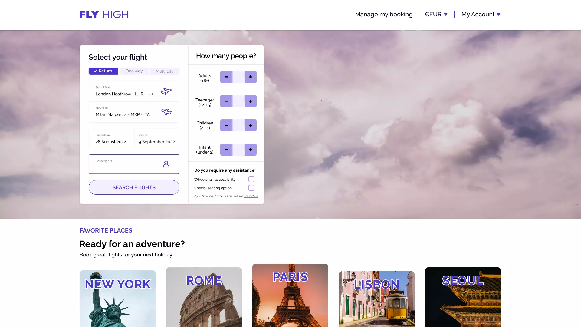
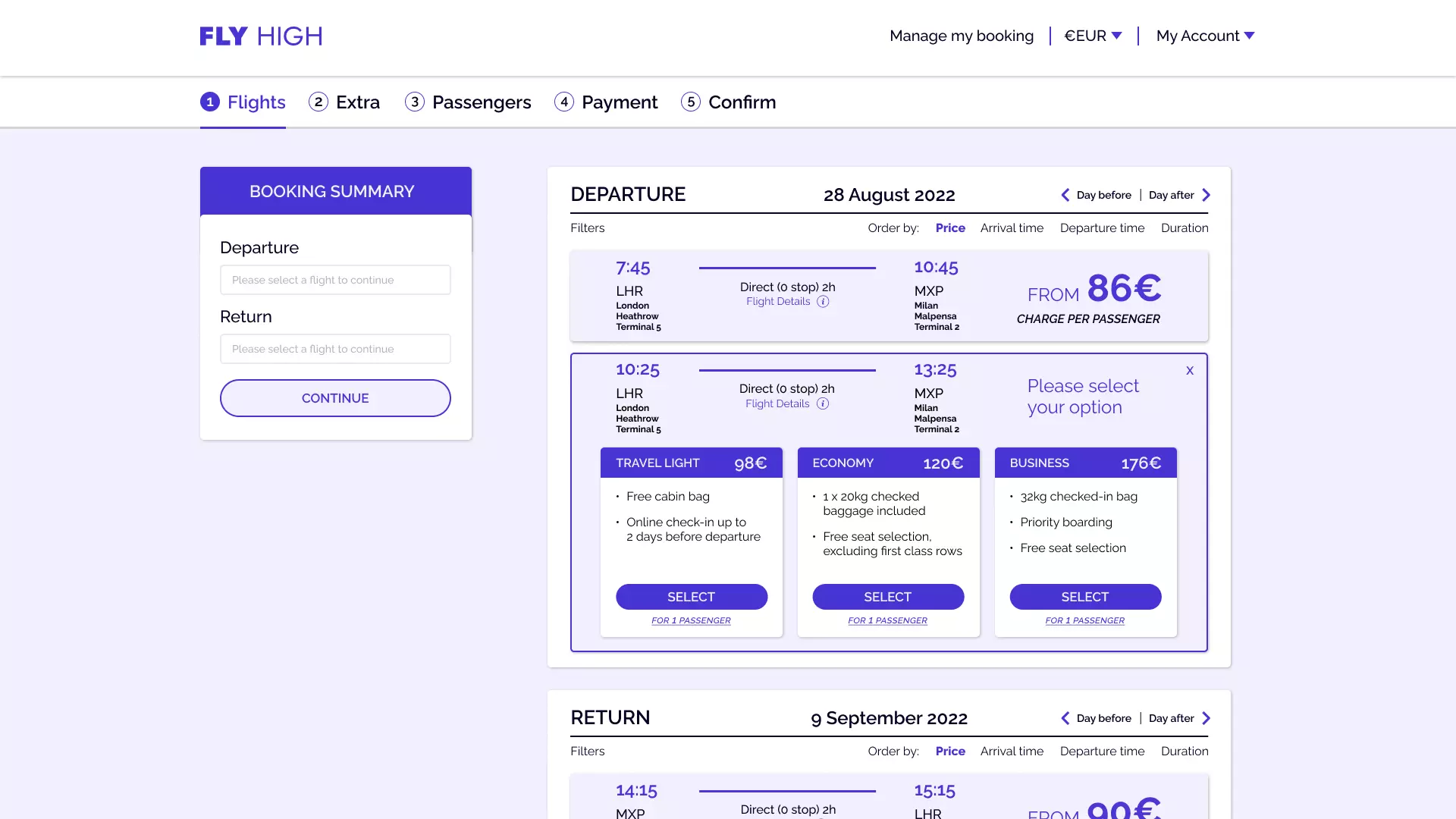
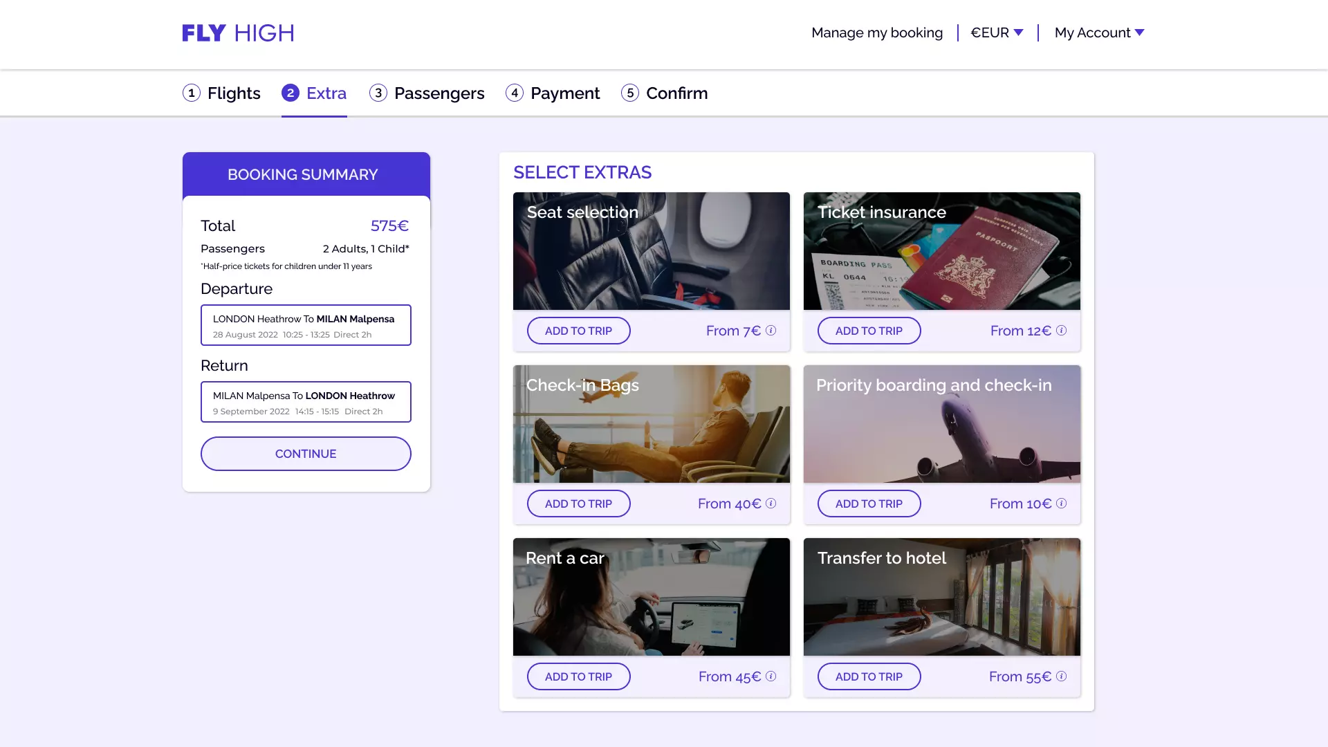
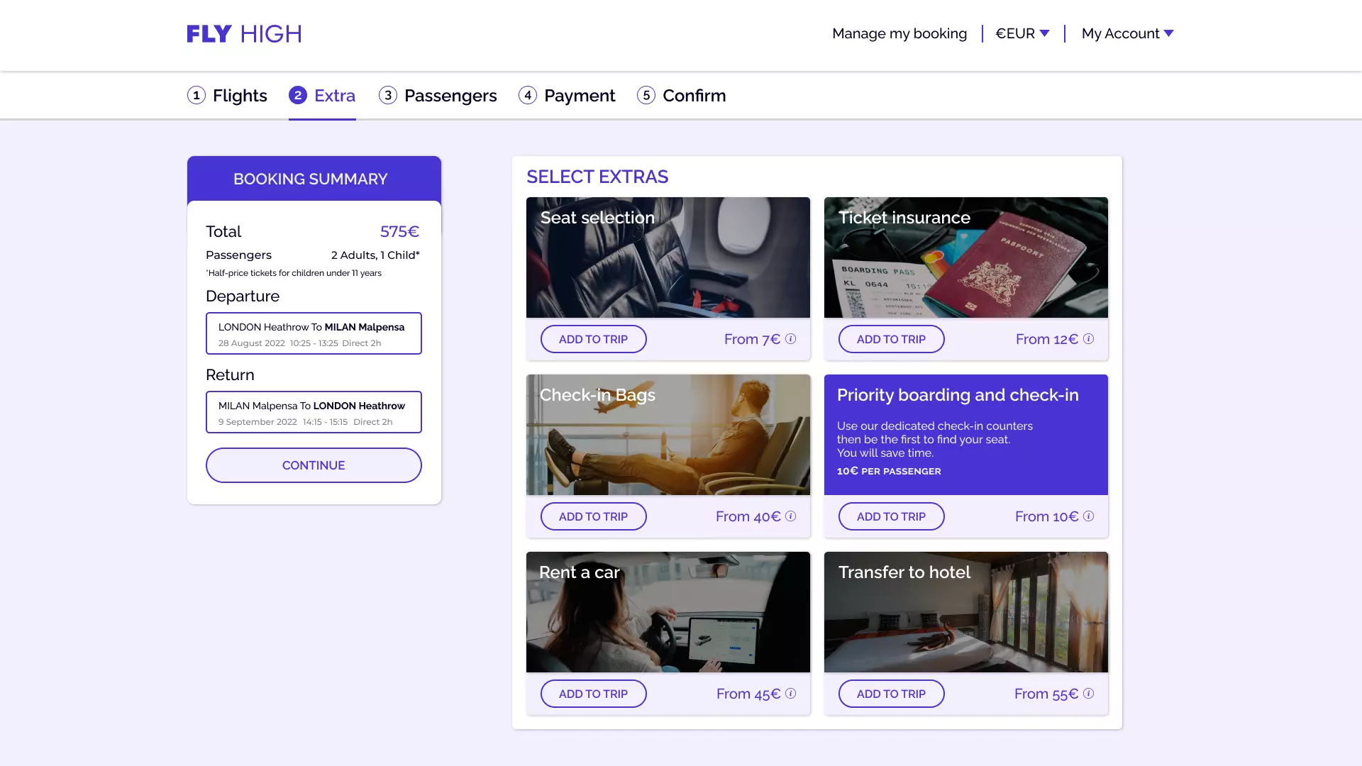
Additional queries, like passenger count, are selected after the results are displayed, as they don’t affect the price per passenger. Flexible booking options for mixed flights are offered.
In the storyboard below, we're diving into the journey of our users to better understand their behaviors and interactions. Think of it as a story where each scene reveals a bit more about how users engage with our product. This will help us identify what works well and where we can make improvements.
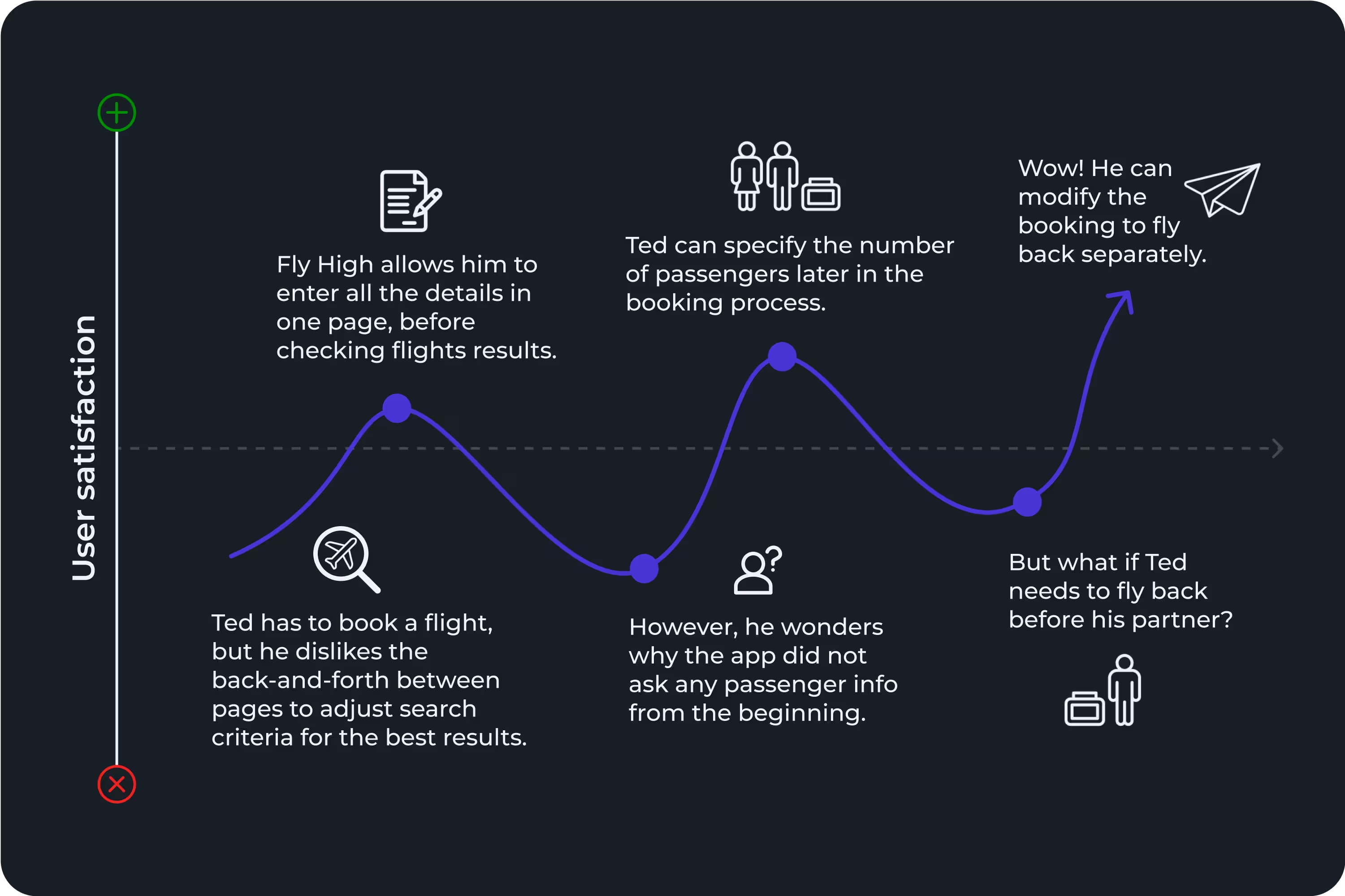
Our hypothesis was that to simplify the search we should focus on key details for the price-per-person. But this backfired—users were confused when they couldn’t enter passenger details upfront, expecting it on the first page. Navigating back and forth between multiple dialogue boxes and the main page further disrupted the flow.
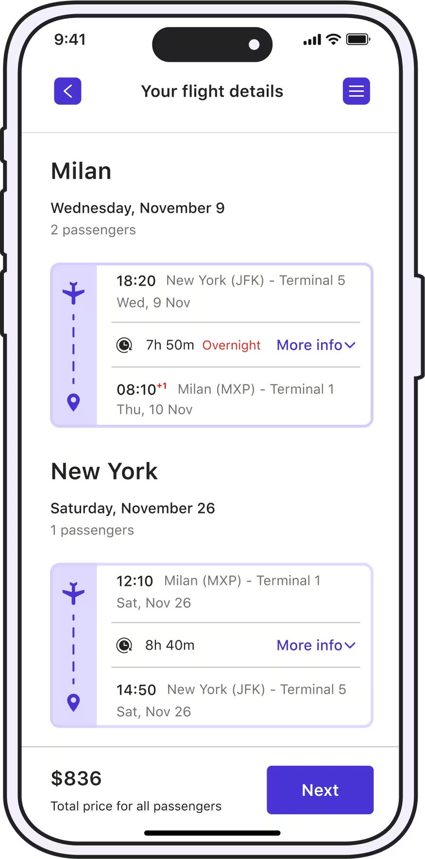
Reduce clicks and navigation between dialogue boxes by using a coherent question flow. Travelers provide key details sequentially, used for the price estimate in the calendar, before going back to the main page.
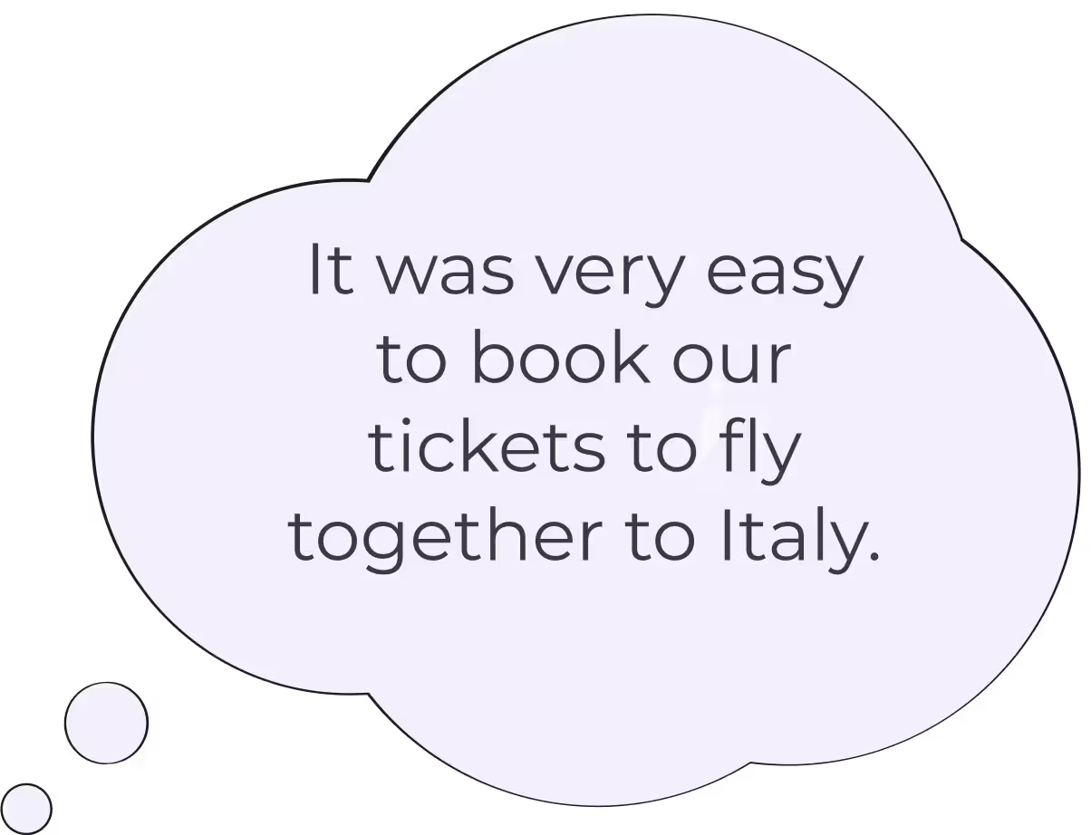
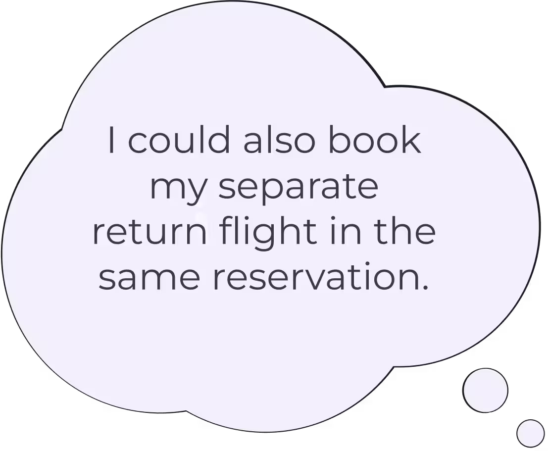
Passengers can still book a trip with one-way flights together and return flights separately, avoiding the need to start a new booking and re-enter overlapping information.
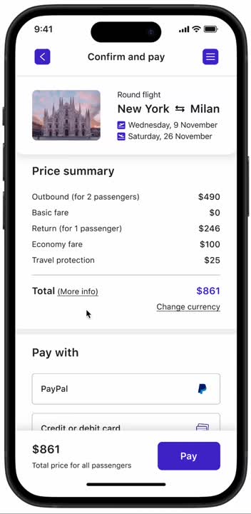
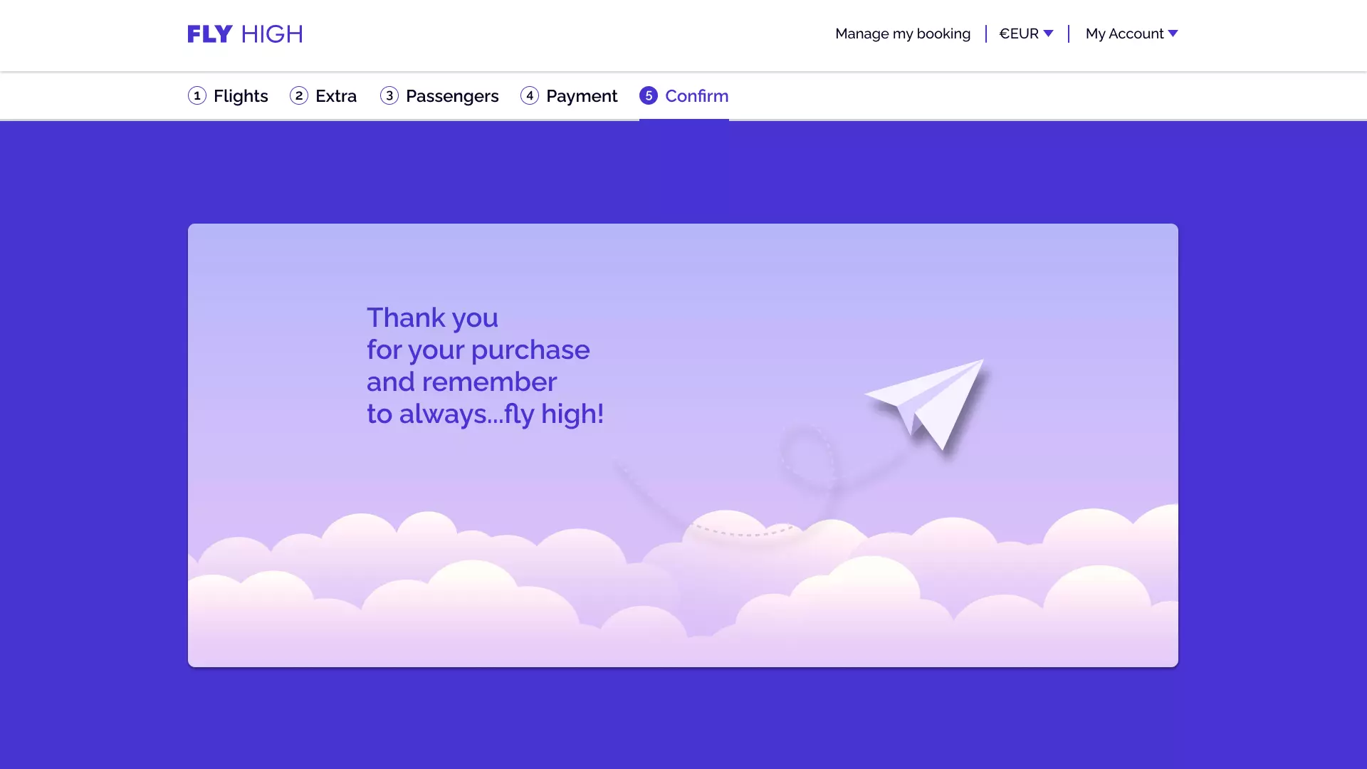
Guiding the user to a secure payment at the end of the booking process, while allowing currency changes directly on the page.
I created a high-fidelity prototype to simulate the actual product experience, with interactive features, emphasizing visual hierarchy and affordances.
.webp)
.webp)
.webp)
.webp)
.webp)
.webp)
.webp)


By implementing this design, users no longer navigated multiple screens or repeatedly searched for price changes, and quickly adjusted passenger numbers on the first page. With a 60% improvement in time-per-task, this solution enhanced user experience, but also contributed to better potential business outcomes by increasing efficiency and satisfaction.
Users focus on booking needs instead of trial-and-error, which reduces frustration and cognitive load, making the search process more intuitive and user-friendly.
A straightforward search process reduces confusion, helping users find the best flight options faster, likely increasing satisfaction scores and lowering user complaints.
Simplifying the process encourages users to complete bookings, can result in higher conversion rates, better revenue, and it can reduce search abandonment.
The checkout user flow simplifies navigation by shortening the path through the app, enabling users to complete bookings more quickly and efficiently.
I tackled this UX project with confidence. Research methods provided valuable insights, and I enhanced my communication skills while unleashing my creativity through interactive prototypes.
Gathering extensive information is crucial for designing a website that meets client needs. By understanding users and collaborating with developers, I can create a site that satisfies everyone’s expectations.
I structured a particular booking task for them and proactively gathered their feedback on the page experience, identifying issues they faced while navigating certain checkout phases.
I structured a particular booking task for them and proactively gathered their feedback on the page experience, identifying issues they faced while navigating certain checkout phases. add %
Video From currency page to payment secure and in one page w/out scrolling.
Fare come ha fatto oliver di Suggested Jobs ZipRecruiter•2020 in group Header anatomy logo apple con linee ecc.
Initially, I conducted interviews to draw in-depth insights directly from users. Using a recruitment screener, I identified target groups based on:
I structured a particular booking task for them and proactively gathered their feedback on the page experience, identifying issues they faced while navigating certain checkout phases.
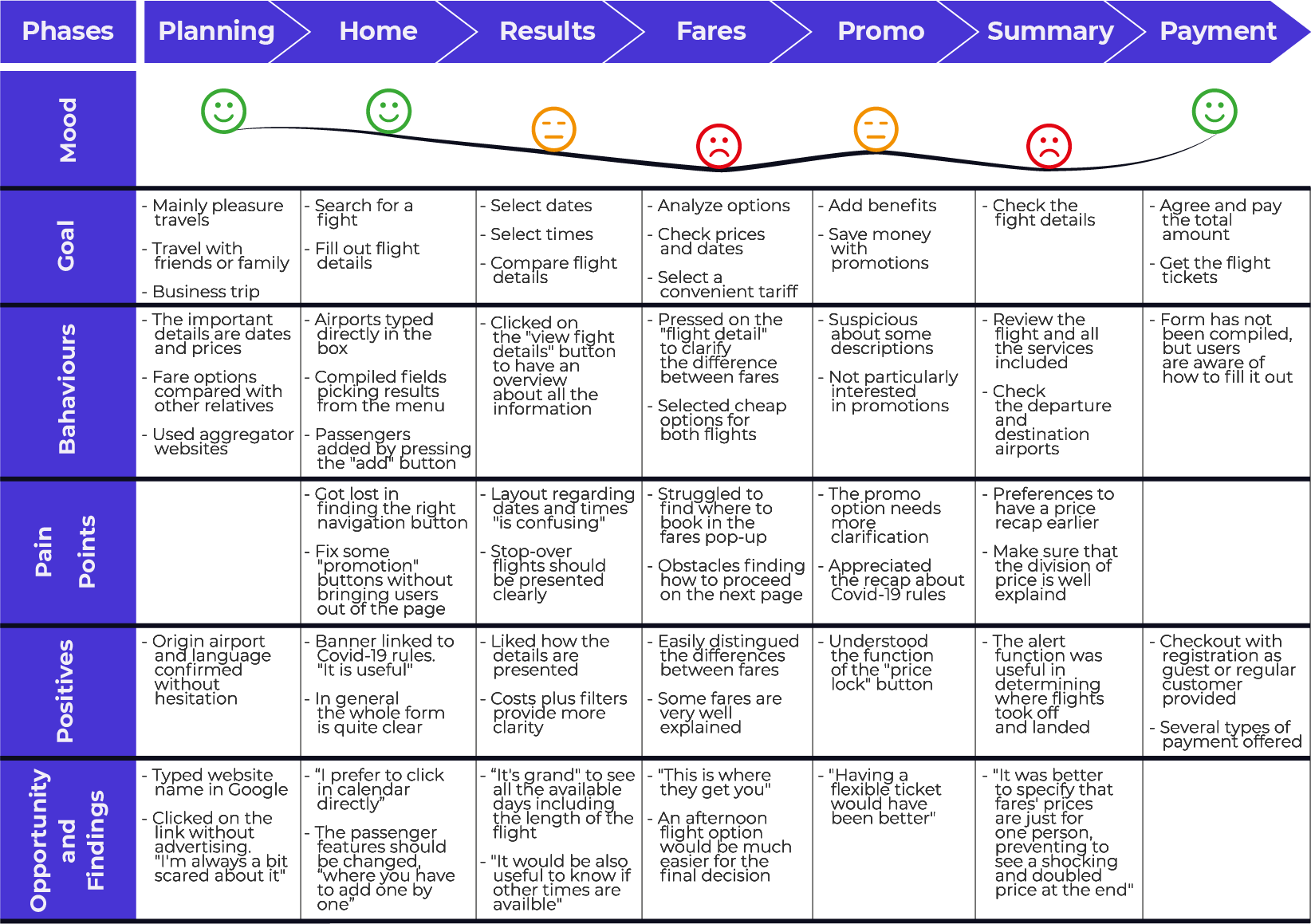
Studying how people use airline websites helped me to facilitate them through tests, including understanding how they behave.
In the analysis, I began to sort and understand complex information, identifying user research patterns that were crucial in guiding me through the design process.
After scanning all the unstructured data, I was assisted by an external collaborator in summarising findings and ideas.
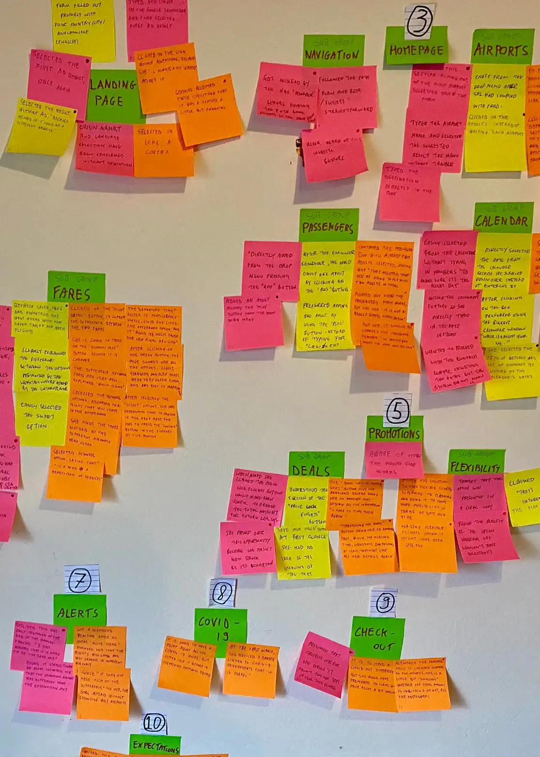
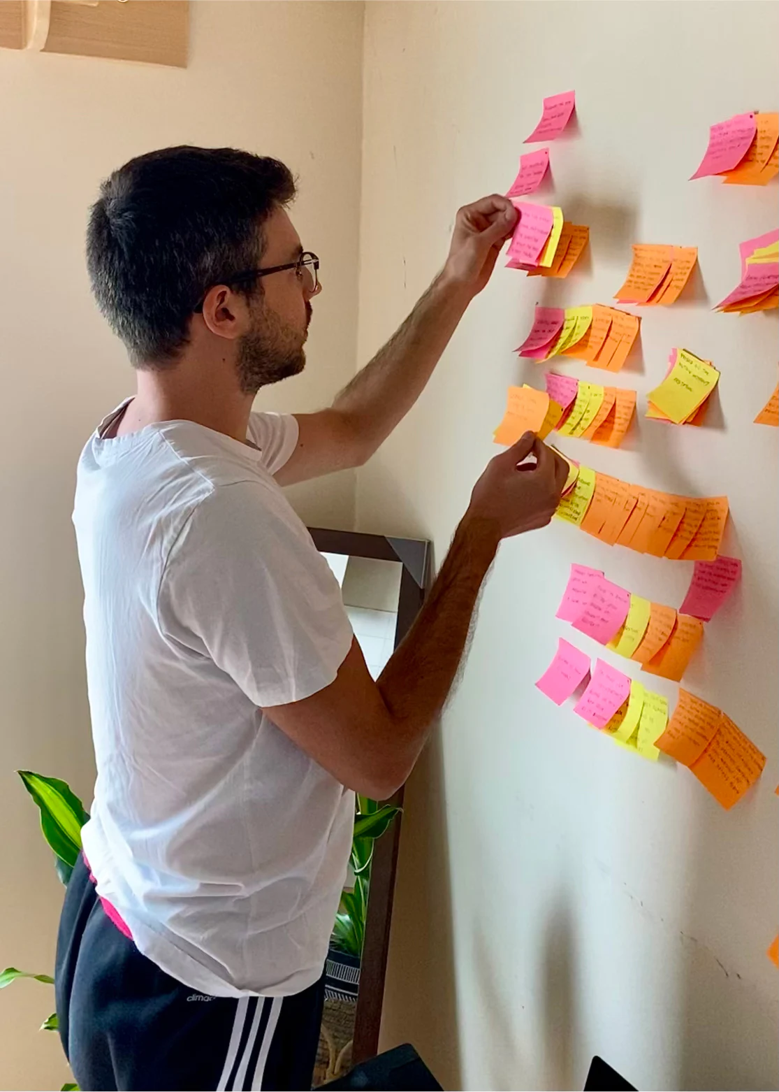
We split all the leading insights into categories bringing out pain points, user needs and potential trends.
The research indicated that users experienced confusion due to unnecessary steps and intrusive pop-ups. Implementing the following tool facilitated process simplification, enabling me to prioritize essential elements and make more informed project decisions.
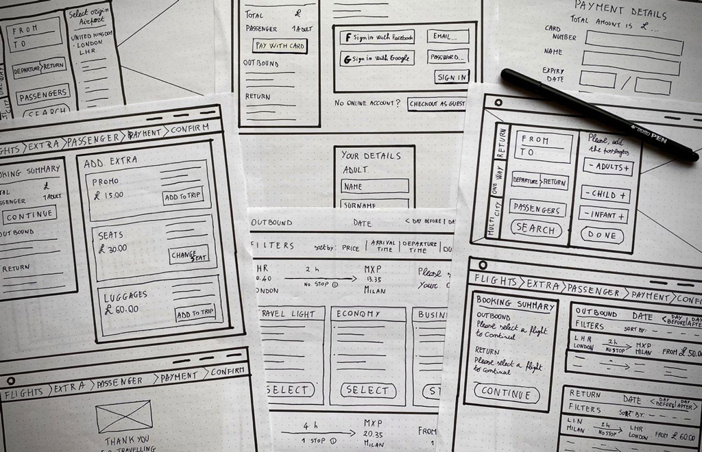
After identifying key issues, I prioritized designing new ideas and features. My initial aim was to simplify the booking process, seeking to minimize steps and clicks, as illustrated in my flow diagram.
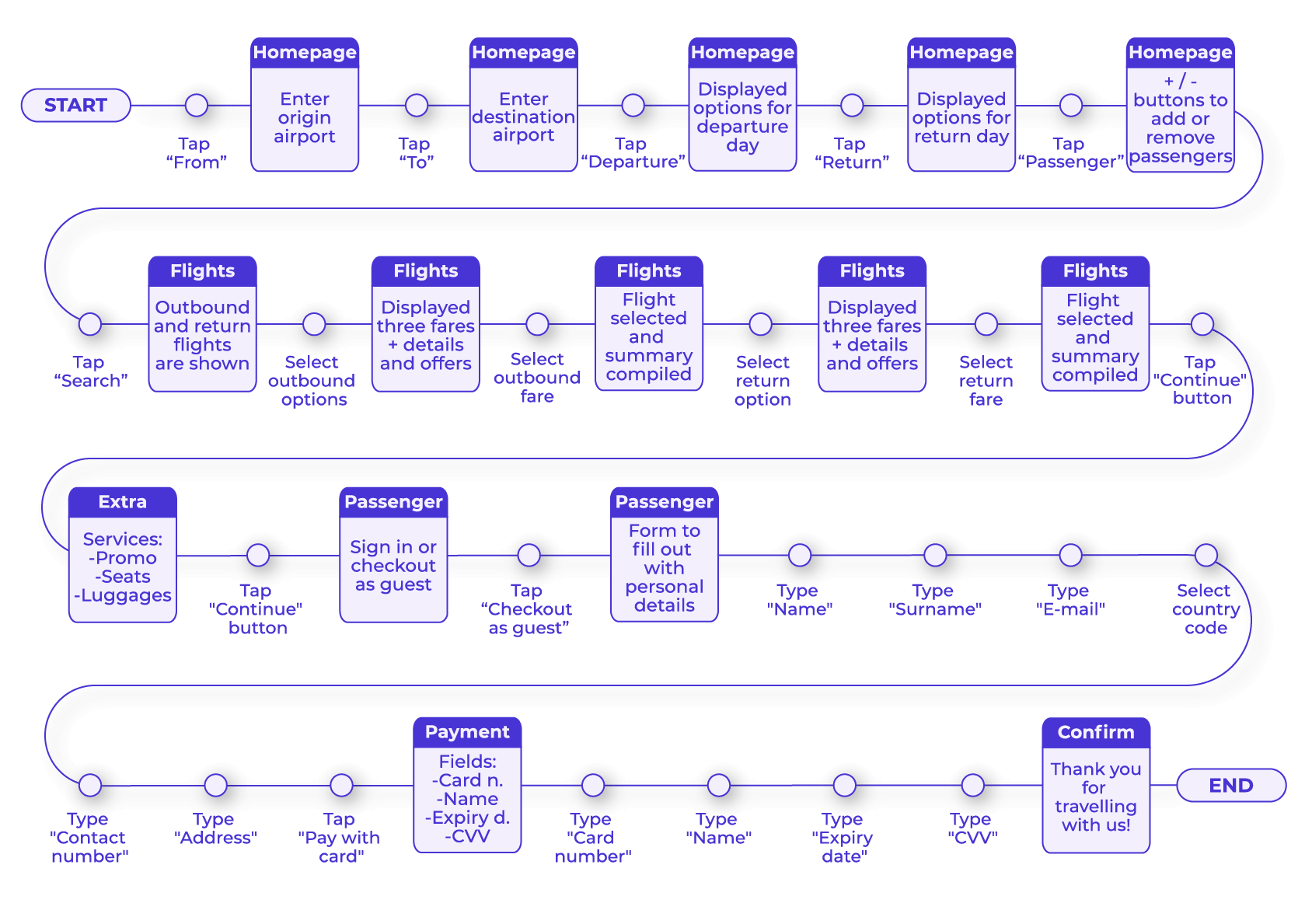
Initial sketches based on the flow diagram are presented here.
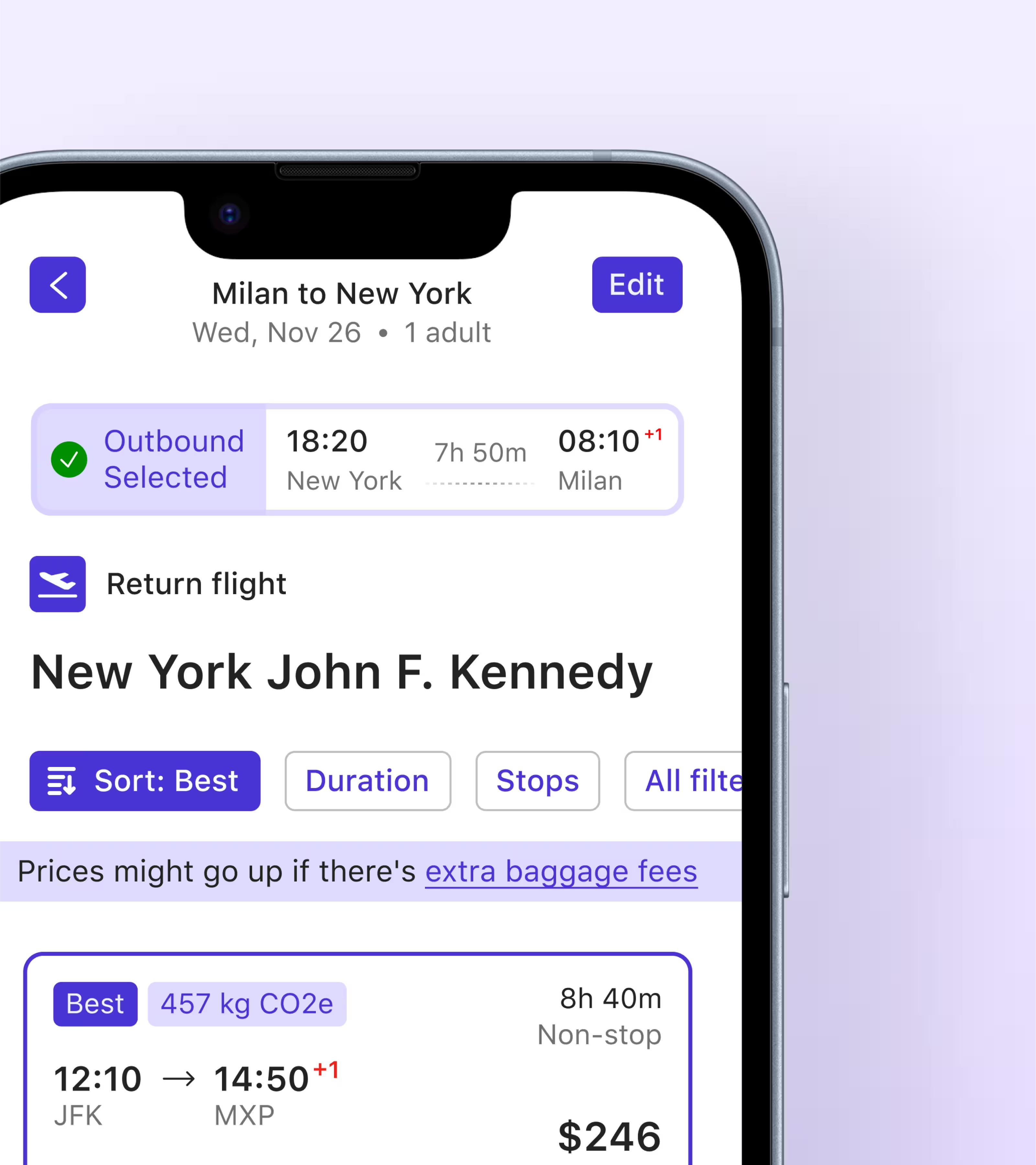
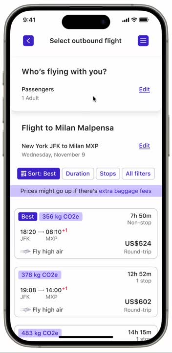
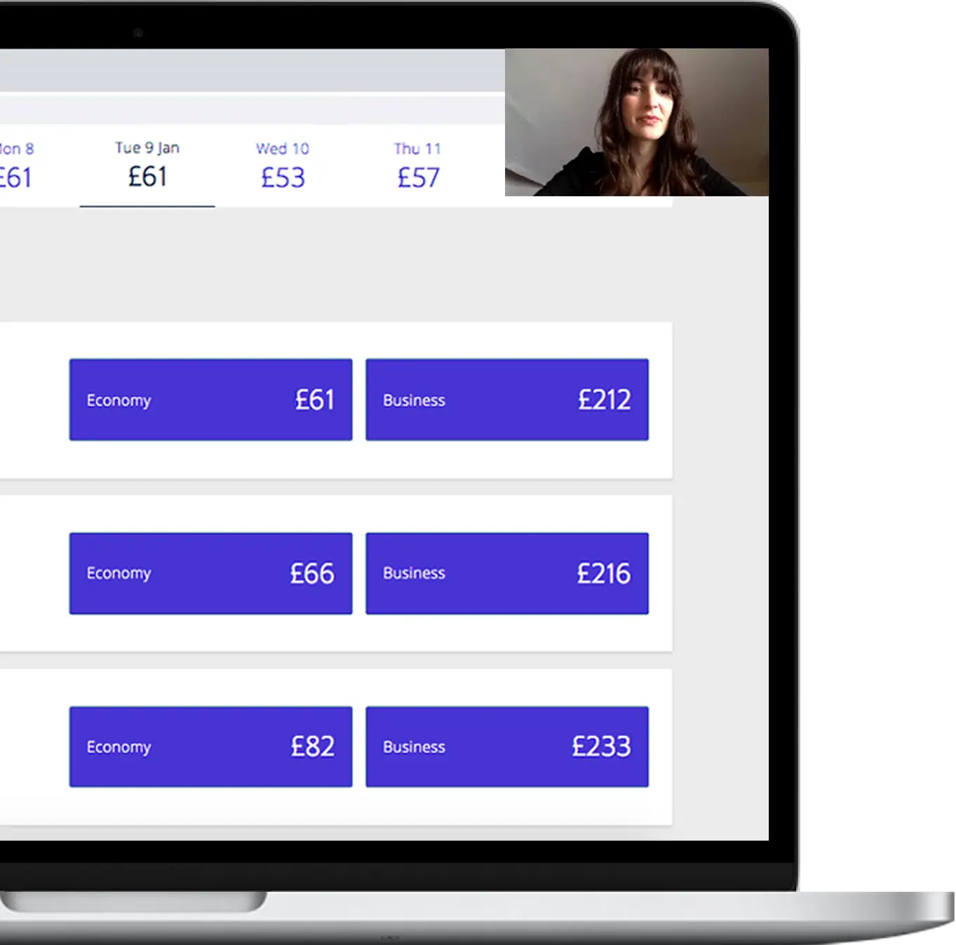
In my research findings, people wanted the important stuff up front: flight times and prices. So, I made sure to put these in focus to avoid any distractions. Also, when booking as a group, they often asked, "what's the cost for each of us?".

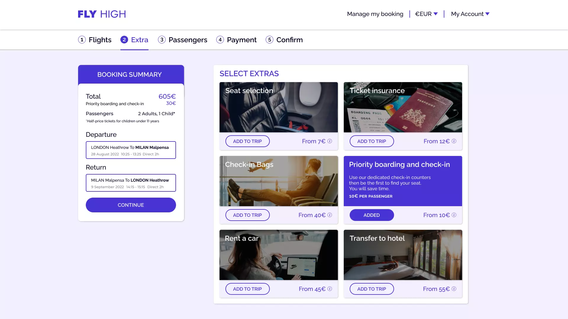
So, that's why on the flight results page, I displayed the price per passenger and simplified the choices by adding filters based on your preferences. I also decided to add a progress bar to keep users informed about their task's remaining steps.
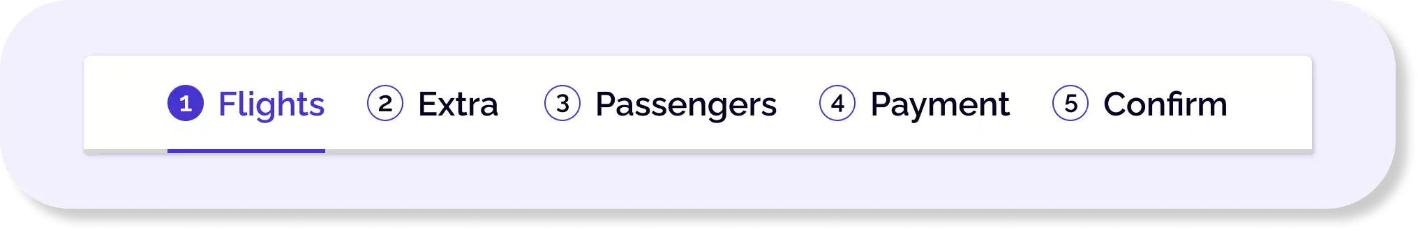
I included a page where people can discover all the exclusive add-ons, following the consistency and usability design principles. Next, it's crucial to test this feature with developers for a comprehensive evaluation.
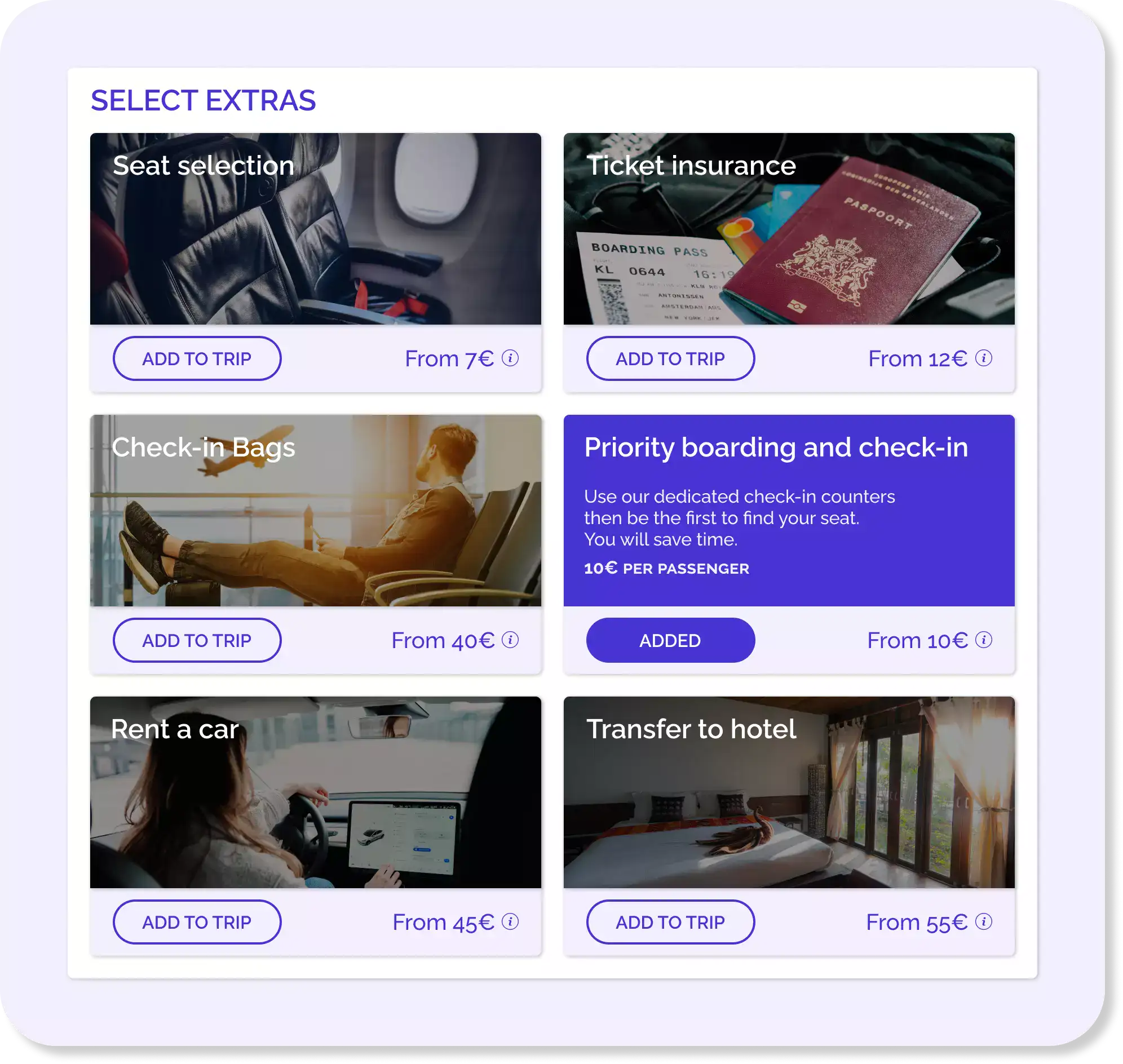
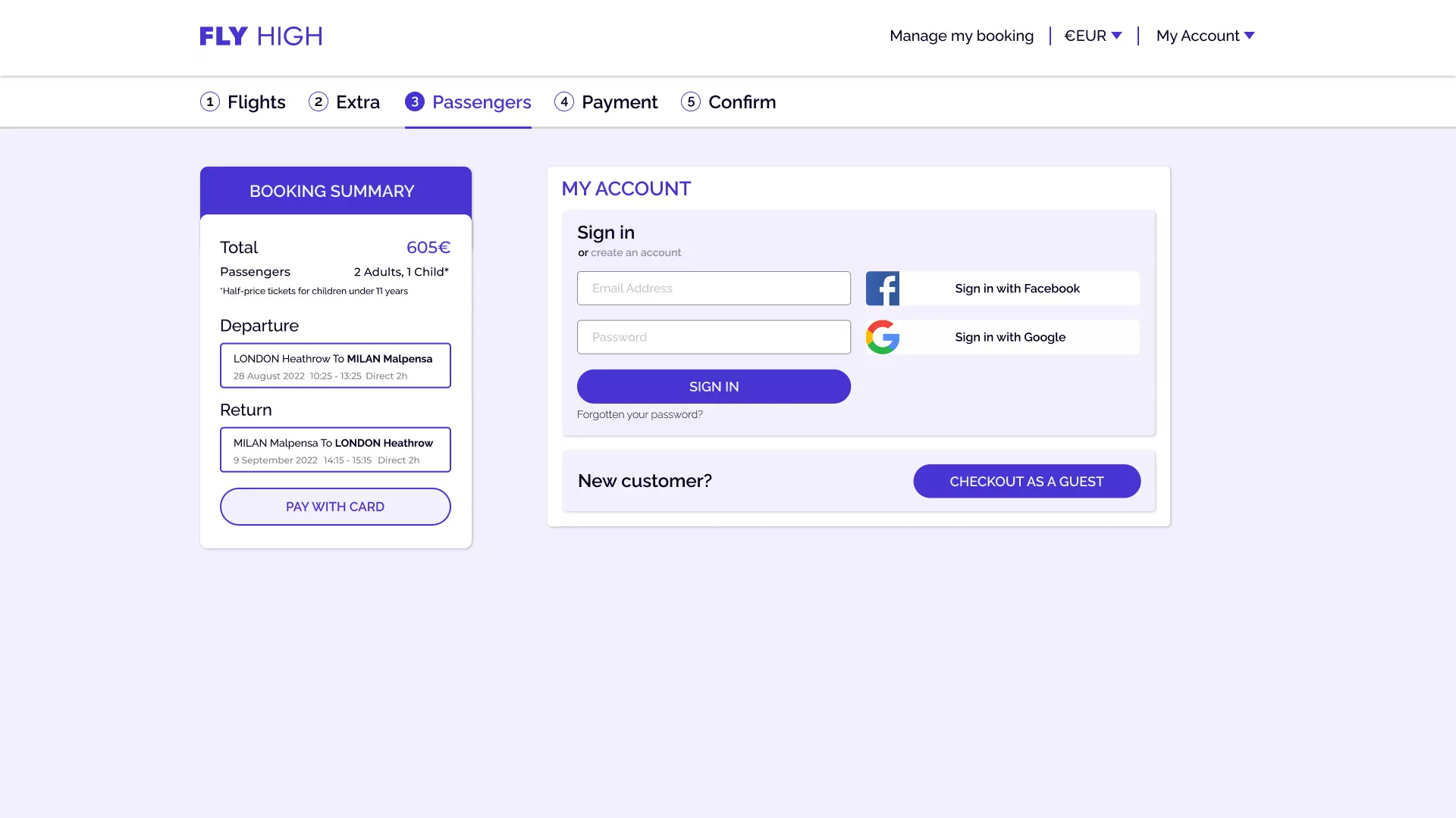
Based on Baymard Institute's 2022 research, 24% of users tend to leave when forced to create an account. So, I decided to facilitate the purchase process. How? By simplifying registration, allowing new customers to buy as guests during checkout.
This simple step improves usability and promotes purchasing by including the user’s will and avoiding the loss of sales.
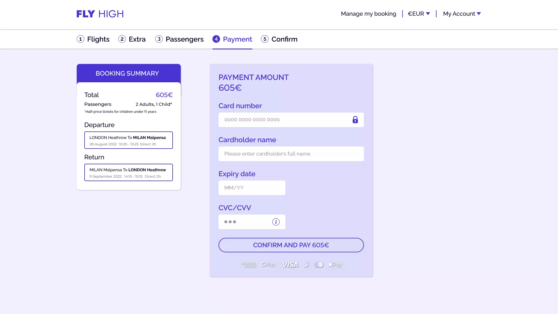
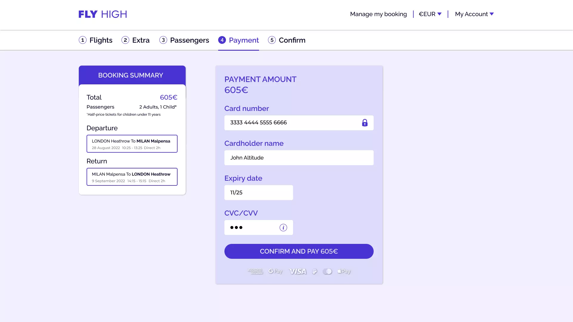
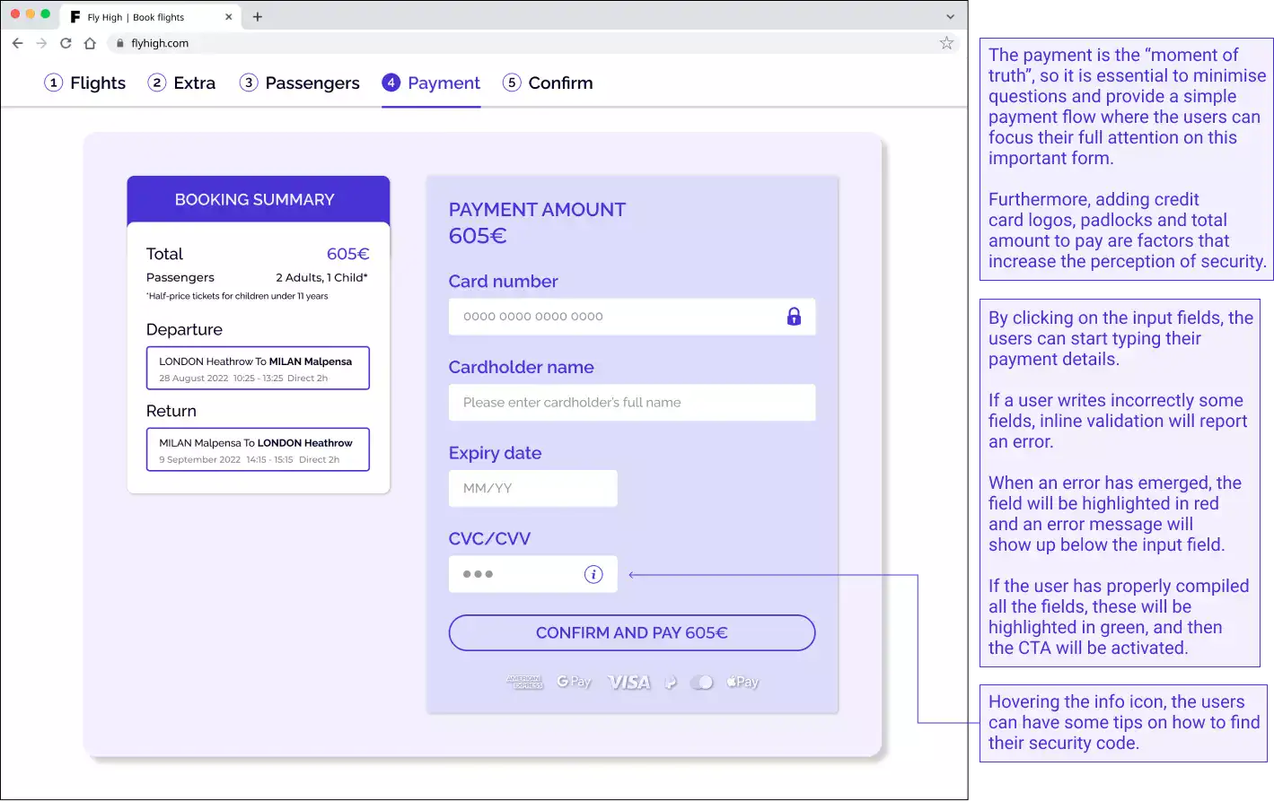
As users approached the crucial payment step, I embraced a minimalist design to build trust. Ensuring security, I provided diverse payment methods, guiding users through a traditional process: What's being purchased? And how much is it?
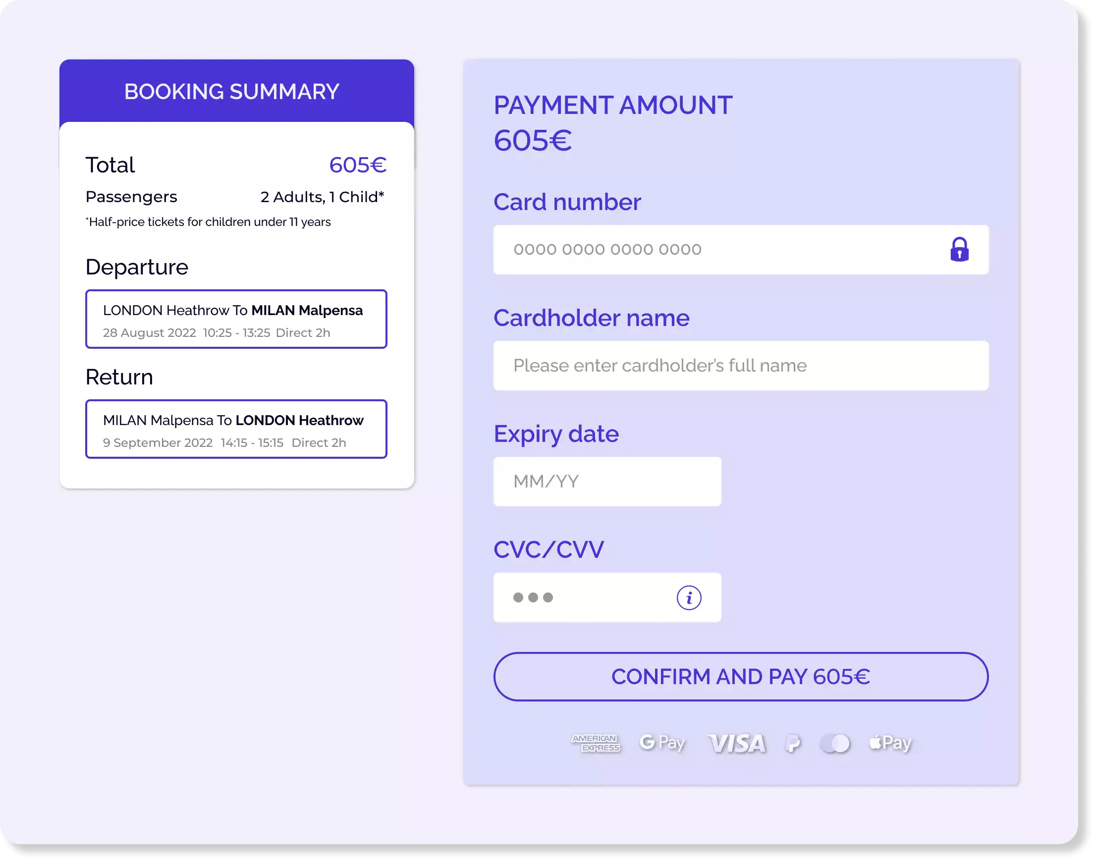
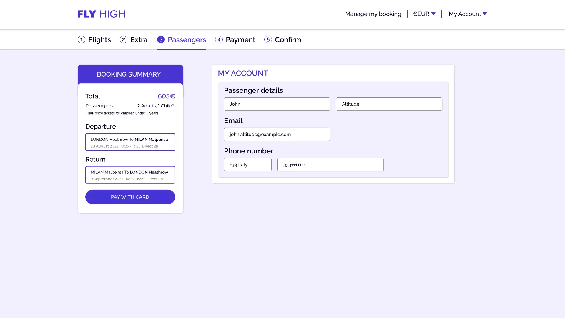
Moreover, for a great experience, I should collaborate with developers, including UI designers, to create input fields that automatically format numbers and text, making them easier to verify and minimizing errors.
After identifying key issues, I prioritized designing new ideas and features. My initial aim was to simplify the booking process, seeking to minimize steps and clicks, as illustrated in my flow diagram.
Initial sketches based on the flow diagram are presented here.
In my research findings, people wanted the important stuff up front: flight times and prices. So, I made sure to put these in focus to avoid any distractions. Also, when booking as a group, they often asked, "what's the cost for each of us?".
So, that's why on the flight results page, I displayed the price per passenger and simplified the choices by adding filters based on your preferences. I also decided to add a progress bar to keep users informed about their task's remaining steps.
I included a page where people can discover all the exclusive add-ons, following the consistency and usability design principles. Next, it's crucial to test this feature with developers for a comprehensive evaluation.
Based on Baymard Institute's 2022 research, 24% of users tend to leave when forced to create an account. So, I decided to facilitate the purchase process. How? By simplifying registration, allowing new customers to buy as guests during checkout.
This simple step improves usability and promotes purchasing by including the user’s will and avoiding the loss of sales.
As users approached the crucial payment step, I embraced a minimalist design to build trust. Ensuring security, I provided diverse payment methods, guiding users through a traditional process: What's being purchased? And how much is it?
Moreover, for a great experience, I should collaborate with developers, including UI designers, to create input fields that automatically format numbers and text, making them easier to verify and minimizing errors.
To guide the developers effectively, I compiled clear instructions in the next document, outlining all the necessary details and annotations.
I created a high-fidelity prototype to simulate the actual product experience, with interactive features, emphasizing visual hierarchy and affordances.
I tackled my first UX project with confidence and determination. Advanced research methodologies helped me gain valuable insights, and my supervisor's guidance enabled me to succeed. Accurate and trustworthy results followed, and my communication skills improved through affinity mapping collaboration. Interactive prototypes unleashed my creativity.
It's important to take the time to gather as much information as possible, to create a website that truly meets the client's needs. So, by learning more about users and their goals, and working closely with developers every step of the way, I can design a site that satisfy everyone's expectations.

To guide the developers effectively, I compiled clear instructions in the next document, outlining all the necessary details and annotations.
I created a high-fidelity prototype to simulate the actual product experience, with interactive features, emphasizing visual hierarchy and affordances.
I tackled my first UX project with confidence and determination. Advanced research methodologies helped me gain valuable insights, and my supervisor's guidance enabled me to succeed. Accurate and trustworthy results followed, and my communication skills improved through affinity mapping collaboration. Interactive prototypes unleashed my creativity.
It's important to take the time to gather as much information as possible, to create a website that truly meets the client's needs. So, by learning more about users and their goals, and working closely with developers every step of the way, I can design a site that satisfy everyone's expectations.